15 April 2014

Agostino Iacurci - Street Artist


moscow1For this post, I choose to share the work of street artist Agostino Iacurci. What I find so interesting about him is the style of his pieces. His works of art are so clean around the edges, that they sometimes look as if they could have been done in Illustrator. I think that his style can be used as possible inspiration for designers.

 Aside from the style, the figures in the pieces are just as interesting as they are each unique in their own way.

atlanta_agostino_iacurci
3_red


http://www.agostinoiacurci.com/category/works/
Agostino Iacurci
Agostino Iacurci

An interactive World!


OK lets face it, you see a poster advertising a company or something but that's all that poster does, and sometimes it gets boring. I was looking at poster designs and I stumbled across posters that are interactive!

I think all posters should be interactive its something that stands out from the rest and its fun! Here are a few of my favorites that I found online.

This is a Pepsi Poster in a subway train where they have an earphone input where u can listen to who knows what haha

This is a cool interactive poster puzzle for a McDonald's ad promoting their coffee.

This poster was printed on bubble wrap paper to give that interaction that you are actually typing by hearing the noise from the pop!


Here is a short video showing simple interactive posters! enjoy!

CGI Chimpanzee's a reality?

So this awesome company turned a digital Chimpanzee into a living, breathing, story.

Here it is:

http://www.youtube.com/watch?v=5QUqp6VJIKI


The team at Mill did an incredible job working with both realism and a story line that captivates the audience and impacts us.

http://www.cgwires.com/developing-a-100-cgi-chimp-for-petas-98-human/


So why CGI Chimpanzee's? Or any other thing for that matter? When you use an animal in a production setting that animal must be trained and removed from its natural environment. These designers took quality to a whole new level. They broke down the animation into every conceivable section and used this as a building block for their design.

I don't know if I would personally like to create hyper-realistic designs, but I do enjoy the science and detail that went into the process. It would be really challenging to take on such a detailed quality, because if you mess even a small movement up, then the entire project is not realistic.

09 April 2014

The die Line Dot com

I know or at least bet that most of you have bee not this site but I wanted to share it because it has so much to offer for all sorts of design and designers. The website is Thedieline.com. It has so many categories and so many pictures to look at for inspiration its outstanding. There are a lot of projects from students and kids working their way up in the design world. The site mainly focuses but is not limited to package design. The section I was just looking at was the toys and games section.
                                                                                 These are just some plain cards someone designed. Old school sailor status and just well presented.  


This site could be very helpful and motivating for you to just send your stuff in and get it posted. Get your name out there and show off what you can do.

08 April 2014

Sustainability in Design

So I found this site on sustainability that has 72 different eco-friendly packaging designs. Considering where the world is heading, packaging that uses minimal materials and still looks good is going to be something that will be key for us to be able to manage as designers.

Here are a few of my personal favorites:


An egg carton that uses less material than your average carton from the store (oh and it's cardboard so it decomposes quickly) yet is still fully capable of protecting very fragile eggs.

Here is an envelope that once you send it off and whoever you're sending it to receives it, they can then take off the mailing information and use it as a grocery/tote bag.

Here is a seed envelope (for beets in this case) that once you plant the seeds that come with it, you can use the stake to mark your garden, and the packaging and instructions can be planted to grow flowers. Nothing gets thrown away with this one.

There are MANY more examples on the site linked above. Maybe we can pull some inspiration from them in our own designs in order to be eco-friendly as designers.

FEATURING: Typography & Layout design

I am excited to share this website because I am interested in typography and layout design. I don’t remember how I came upon it but like that it focuses specifically on typography in Switzerland.It is called swisstype.net. The idea of taking pictures of cool design wherever you go is great.

The picture of these two theater posters came from the website. I think they are intriguing partly because of the expressions and gestures of the singers and also the typography. In the Die Zauberflöte (The Magic Flute) poster the decision to hyphenate “Zauberflöte” works because it creates balance as “Flöte” and 17.12 are placed below and above “Zauberflöte.” The diagonal lines are interesting. This is a trend in design that I've noticed.


Finding these posters gave me the idea to listen to Carmen and I came across another good design. The things that stand out the most to me are the bright red illustration in the middle (did you notice the bull head coming out of the folds of her dress?). Also, the layout of the information is organized well. The horizontal line of the CD title leads the eye to the right to the vertical line of pictures. This 90 degree angle is a nice frame for the illustration.The type is also red, and the interesting use of both curves and sharp edges in the type is daring. I think the colors and type choice represent the main character (Carmen) as she is bold, impulsive and seductive.


Learning how to mix different typefaces, especially how to do it well and what to avoid, also interests me. The next example is from a Swiss sports market. I have never seen anything like this example below. A script paired with the sort of bubble slab serif looks like it actually works. The script type is taller and thinner than "sport" so the fat, spread out letters are contrasting. What really catches the eye is "sport" which describes what the store sells so I think that this contrast is a good thing.
One last thing that is not related at all to this post is a design blog I found with great tips for designers. The company is called Effusion and is based in AZ. There is a funny design video I found on their blog. The Process.


Type Everthing!


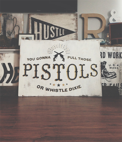
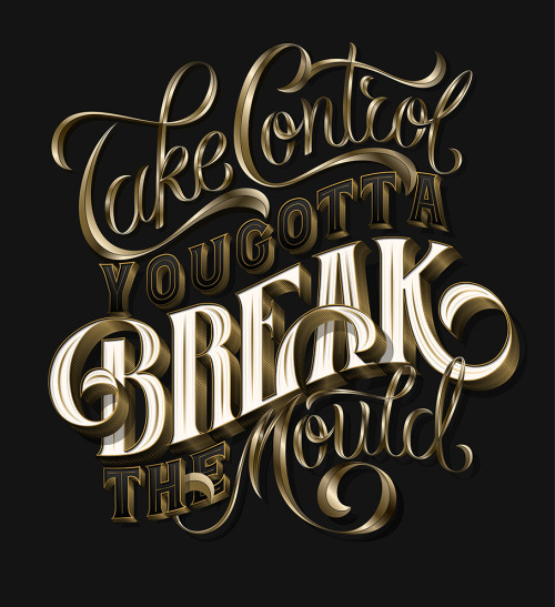
This time around I decided to focus on my personal favorite aspect of design work: Type. In my opinion, Type is both the most beautiful and frustrating part of every project I work on. It is the detail that can make or break a project. It needs to be both beautiful and attention grasping while being simultaneously legible.


I found a site named typeverything that displays assorted images and moving pictures featuring many different styles of type in many different context. I must say the many different calligraphists featured make me very jealous of their talent, its extremely satisfying to watch and the finished product is extremely interesting!