
Showing posts with label 2939. Show all posts
Showing posts with label 2939. Show all posts
18 April 2013
Sam Spratt
One of my favorite graphic designers is Sam Spratt. This guy has a seriously unique and awesome style. I like his use of warm and cool colors to create a melting effect with his designs. I am a total photoshop novice so watching his videos where he creates theses works of art it is really inspiring/intimidating. His art is becoming more well known and he is being commissioned by more and more clients because of his unique style, such as FX and Game Informer. I hope that one day I can create great works of art like Sam. Hope you enjoy his work as much as I do. Sam's work

15 April 2013
Marian Bantjes

The reason why I’m so interested in her is because of her style. Marian has an intricate design and she comes up with designs to do on abnormal creative surfaces that you would barely consider to do, such as etching her design on a gigantic mirror for a poster.

My style seems to be on the simple side, however I want to try and experiment in more complex and intricate designs, since I am drawn to them, especially when they are done right. Which, if it's done by Marian, it usually is. So if you're looking for inspiration, or are attempting to try new things with your designs then I believe Marian would be a great place to look. Also remember, if you're feeling defeated about your future career path as a new graphic designer compared to all the big shots out there, it took Marian 10 years to get recognized, so you still got time to do your thing.
The World of Mad Men in 2013: Advertisements Then and Now
So I came across an article on Designer Daily that I found particularly interesting titled "The World of Mad Men in 2013." This article contained a series of pictures from different advertising agencies today, which were compared to advertisements in the 60's. Funny enough, most of the ads mash-up quite well and are eerily similar. It seems that not only is fashion and music coming full circle to older decades, but graphic design is as well! Here are the advertisements from the article:


08 April 2013
Artwork for the Homeless
I read a really interesting article
about the nonprofit Weingart Center that helps provide for homeless people in
Los Angeles. They partnered with the creative agency, David &Goliath, to
increase awareness of the need for donations in order to provide people with
counseling, jobs and housing. These David & Goliath artists sketched
outlines of typical bedrooms and furniture around homeless people on the streets to show that
with donations these possibilities of providing people with homes could become
a reality. I love this campaign and how it shows exactly what their goals are.
They also made it extremely easy for people walking by to donate. Small signs
explain how to donate simply by sending a text. It is so easy to pass by people
on the streets and think maybe next time I will remember to bring some
money/food/etc. to give to that person, but this campaign brings the problem
front and center and presents a simple solution for donating. Seeing this has
really changed my perspective on what can be changed and what is possible.
John Stevens, a current
student in the Set & Exhibit Design Bachelor of Science program at The Art
Institute of California – Hollywood, played a key role in the campaign. In an
interview he said, “We had several people who were walking down the street
that stopped to look at each of the scenes and catch a different perspective on
homelessness. Some of the individuals walking down the street even sent texts
to donate money. It's an incredible feeling to be able to witness your own art
making an impact.”
Check out the link to see some of the artwork.
01 April 2013
Coca-Cola Orange Juice Packaging

In light of our recent package design project I came across this and thought it was very interesting due to the fact that they made the individual packages interact with each other in that you need two cartons to have a full orange. I thought this was clever because not only does it draw the attention of the customers walking by but it makes the display feel more complete rather than just a bunch of individual cartons. Bravo Coca-Cola, bravo.
Does

I believe I have posted this artist before from the Ironlak blog. "Does" is a graffiti artist who inspires my work continually not only from a street art view but also and mainly for his clean work and ability to work, and also technique and incredible color scheming.
This series of work that he has started not to long ago are four panels set up on walls each panel is assembled by two seperate pieces so there is eight total but four total surfaces. Does allows his pieces to go off the panels and much wider than it has to be as you can see from the picture. The painting is done in one day and when complete he just takes the panels off and takes them. After he takes those panels off he paints the rest of the wall to the original color as when he started, so as if to create a one day work and has no problem erasing it as if it were never there. I like to think of it as the wall being blessed with talent for a couple of hours and taking four pieces to collect being portable for anything special in the future. Not so many artists can do that.
Does mastered his craft as a graffiti artist and is an iconic figure to many other graffiti artists and any kind of artist who is as disciplined as he is. I will always enjoy looking at his art and follow his blog.
31 March 2013
Grafik Intervention Flagstaff
This is a project we are
doing in my VC370 class. I think that it is a great opportunity to use design
to draw awareness to our own community and what is going on in the neighborhood
around us. We found several buildings in the downtown area and will be creating
these installations to display during the First Friday Art Walk in May. Follow
us on Facebook at Flagstaff Grafik Intervention!
 It was originally
conceived as an MFA graphic design thesis project at the Academy of Art
University, William Culpepper’s Grafik Intervention uses digital projections to
engage the public through visually dynamic and compelling communication
methods.
It was originally
conceived as an MFA graphic design thesis project at the Academy of Art
University, William Culpepper’s Grafik Intervention uses digital projections to
engage the public through visually dynamic and compelling communication
methods.
Projections are designed
to provide historical information in an urban context. The goal of the
projections is to inspire community members to consider the potential of
currently unused buildings in their community.
 Background
Thus far, five cities and
over a dozen buildings have used the Grafik Intervention process to engage a
community and create dialogue through graphic design. Previous interventions
were performed by graphic designers and design students from across the
country, as interest has increased, several more designers and students have
expressed interest in implementing their own Grafik Interventions around the
country, with several planned in near future.
Process
Buildings are identified
and selected based on their abandoned urban spaces and potential for
revitalization. Within each identified city, several case study buildings were
carefully selected based on their notable history and location, in contrast to
their current state of abandonment.
Projections
Each of the identified
case study buildings are then thoroughly researched and documented. The content
of the researched information about a building’s historical usefulness is then
projected onto the building façade creating a juxtaposition, thus illuminating
each building’s current potential.
Results
Digital and printed
questionnaire cards elicit information from the general public as they pass by
the selected case study buildings and become engaged by the dynamic projected
visuals and the real-time discussions. The goal of the questionnaire cards is
to engage the general public with a series of thoughtful questions that help
evaluate the success, visual interest and communication methods achieved with
the projections.
11 March 2013
SPOON GRAPHICS- Freebies, tutorials, and more!

While working on one of our many assignments, I wanted to figure out a way to texturize a logo in Illustrator. Thus far, I've only experimented with grunge textures in Photoshop, but the Brits at the Spoon Graphics Blog gave me plenty of help with my Illustrator endeavors! Not only were there 5+ tutorials covering different aspects of the design I needed, but Chris Spooner created a Vector Texture Freebie Pack that I could use and someday emulate on my own.
There are tons of detailed articles, and even more free packs that are really helpful! The tutorials are easy to read, and include great pictures to help you follow along. I feel like there are always tutorials online, but the amount of comprehensible tutorials is far more limited. If you need help with an effect, or creating a specific type of graphic, I'm sure Spoon Graphics has it! I know it will definitely be my first stop the next time I'm having trouble with something!
TeeFury

TeeFury, which I'm sure most of you are all familiar with, or have seen certain designs on other people's shirts and went "Holy geeze, I need to get me one of those."
TeeFury is a website that has the most creative designs for t-shirts from popular shows, video games, and the likes. All these shirts are designed by people that have submitted their work to this website and have then gotten their design selected to be on a shirt and sold. The designs that are selected get paid from every shirt they get sold and get 24 hours of stardom.
Not only does this website help designers or creative people get noticed, it shows how others have taken a creative look and thought outside the box about a popular trend. And in most cases have come up with a mash up of two popular things, like Zelda and Star Wars (as shown above). So whenever you're feeling lackluster or down in the dumps, you can get a few laughs from the designs at TeeFury, get inspired by some of the creative designs, or try for yourself and submit one of your awesome designs today!
04 March 2013
Teenage Machine Age
I ran across some work from Ryan Heshka and thought it was very
interesting the way he designed in the vintage look with the whole
sci-fi appeal of the future. I was drawn to his art because it feels so
similar yet so different, with it's old feeling. It almost makes me feel
like the images could have at one point been photographs, they almost
have an eerie feeling.

His images make me feel like I'm in a time warp, I really enjoy the playfulness they convey.

I found him in juxtapoz magaine.
His images make me feel like I'm in a time warp, I really enjoy the playfulness they convey.
I found him in juxtapoz magaine.
Visual Design: Not Just By Sight
I read an article in Communication Arts Advertising Annual
and Wendy Richmond explains how we see with our brains, not our eyes. It was
really interesting as a designer to think about the question she brings up of,
“how do our brains process the visual world around us?” With this understanding
that our brains working in crazy different ways we are able to be aware of and
understand the details and things that influence our beliefs and actions.
She
goes on to give examples of how when we feel or sense things we see and imagine
them. We see the objects shape, size, contour, etc. We are able to subjectively
perceive the layout.
Simple
observation is important as the brain processes an object. Richmond explains
her exploration into the effect of using different senses such as touch, sight,
sound, etc. to really see, imagine, and create designs. “The brain is not so
single-minded…our senses work together processing incoming information.” We
take all this information and interpret it in many ways in our minds.
She
emphasizes the use of sense and its importance in design. These factors greatly
affect the overall effectiveness of your design. Things are not just marked by
their appearances, but rather by the way people interpret and perceive them. So
we must ask what makes this design resonate with us? Through observation, with
an awareness of your senses, how does it make you feel? Instead of just designing by sight we need to consider how the design will spark imagination and what people might picture and feel. We must understand how
to effectively design for our target audience by learning what senses will
trigger visual perception of a design that will resonate with them.
25 February 2013
Ebon Heath Inspiration

I found this
website while looking for examples of graphic installations for another class.
I think that the installation designs of Ebon Heath are outstanding. On the
website are many images and examples of his work, including other media than
the typographic installation shown here. I think his work on the Stereo.type
pieces really makes us aware about how the medium and presentation of our
creations effect how the viewer “sees” or “hears” what we have to say.
He is a
designer who received his BFA in Graphic Design from the Rhode Island School of
Design in 1994. He lives and works in several places: Brooklyn, Bali, and
Berlin. When he graduated, he founded a design studio that focused mainly on
music packaging, magazine layout, and fashion advertising. He called it
(((stereotype))). He also co-founded Cell Out in 2003, which is a consultant
group that develops media strategies for non-profit organizations, NGO’s, and brands.
He has exhibited around the world. His exhibits include his stereo.type
mobiles, installations, jewelry, and performance art focusing on type. He is
also a visiting professor in Graphic Design at Lehman College and an Art
Director for the Mindpirates Berlin.


The work that I liked the best and thought was
the most unique was called Stereo.type. The website says it is a syntheses of
our typographic language with the physical expression of our body language. It
also claims that these installations make the viewer listen with their eyes, or
how can we make sound and its symbols found in language able to be heard
visibly.
I think that
this designer does a great job of getting us to look at type as a tangible
object, not just something on a page to arrange. He presents it in a way that
makes us think about how we feel about type, and encourages designers to think
outside of the box when creating something.
Wooster Collective 10yr Anniversary
I enjoy visiting woostercollective.com, some of the most creative generated ideas and art concepts that are street influenced is very interesting to me. I started out doing street art and have never lost interest in it, which give me the most influence for taking that into graphic design. This image comes from woostercollective's 10 year anniversary artwork from one of the featured artist who has been contributing to them since the blog site has started. The theme for the artists selected to do artwork for this 10 year anniversary was "what is one thing you learned in the past decade that you wish some one had told you 10 years ago." the featured artist is named ABOVE and he has done so much for public art and gallery work putting in work for so long and is a respected member of the street artist community. ABOVE created this work using screen printing, he wished someone had told him about screen printing much earlier because it became so prominent to his style with using stencils and learning layers very well, and this is the work he created for woostercollectives 10 year anniversary.

11 February 2013
Tutorials: School for the Other Things

CGcookie.com is a website for every type of computer graphic tutorial possible. I am a huge fan of this site. Tons of people come on and submit work and give feed back to other people. A very helpful site that you can create a sign in and enjoy all of the aspects of this website. You can find loads of things, environmental and character graphic painting tutorials, along with some very advanced computer graphics. It comes in all different levels of difficulty and even if you are just curious it has tons of starter videos and written tutorials.
I like this website because it is a great place for design inspiration and it gives you the perfect place to learn about the things you don't get in class. There are so many other ways to create outside the realm of adobe. I think it is great to be able to learn something at the pace that is required for such lessons. You can pause video, you can't always pause class. There are always people happy to answer questions and everyone is there for the same reason, to learn. All of the comments and critiques that happen are mature and welcomed.
The picture above is just an example of the things that people are creating with the help of this website. Here, you can learn about lighting, shades, blender, and a bunch of other things. There is even things like concept creation and design to help get ideas going for those who are interested in that. I find this website a big help when there are other design options I want to explore, I had to share it. I think it is a great way to try new things in this growing field of design.

My favorite artist: David Kinsey
I am a fan of David Kinsey because he has been able
to become a successful graphic designer and fine artist. I love his style of art. His use of texture and color are really appealing to my eye. His style
inspires some of my art that I have worked on in the past. I love the faces he paints because of the expression
he is able to get with a minimal amount of obvious detail. I also like the graphic and
abstracted nature of his pieces. How he is able to make what looks like random
colors in the background double as shading for the figures in the foreground is a skill I envy.
On the graphic design side of things David Kinsey has made many recognizable ads and logos. Some of my favorites are the Apple ipod silhouettes, the new Mountain Dew logo, and the DC shoe logo. He has also created some really cool pieces of street art. David Kinsey can do it all. Another reason I like Kinsey is because he helped create the BLK/MRKT which is a branding agency designed to help a company connect with artists to help create logos and advertisements based one the style of the artist and the need of the company He is also a bad ass. In a interview he tells about a time when he was in Paris Putting up some street art with friends. Kinsey and his friends were taken by French Police and questioned for hours. After he was released he when to the back of the police station and put up some of his art on the wall.
That's about it.
Enjoy.
http://www.kinseyvisual.com/
On the graphic design side of things David Kinsey has made many recognizable ads and logos. Some of my favorites are the Apple ipod silhouettes, the new Mountain Dew logo, and the DC shoe logo. He has also created some really cool pieces of street art. David Kinsey can do it all. Another reason I like Kinsey is because he helped create the BLK/MRKT which is a branding agency designed to help a company connect with artists to help create logos and advertisements based one the style of the artist and the need of the company He is also a bad ass. In a interview he tells about a time when he was in Paris Putting up some street art with friends. Kinsey and his friends were taken by French Police and questioned for hours. After he was released he when to the back of the police station and put up some of his art on the wall.
That's about it.
Enjoy.
http://www.kinseyvisual.com/
Logo Design Love
 The Logo Design Love is a book as well as a website. It first started out as a blog that was devoted to brand identities and logos and giving opinions about the designs.
This website provides articles about logos, more specifically, when to use a logo and when not to. To go with a symbol or to go with a wordmark.
This website can be used for what ever the project that we may have in mind. Not just a logo. With all the information that is easy to maneuver through, it provides great insight on how to design, and should be done and shouldn't be done. Most of the articles are opinion based, of course, but it's always good to consider the elements that you might not have considered before. If you want to find out if a certain logo that you saw earlier today that was horrendous is actually considered a good design or not, this website would be your best bet. As well as David's (Creator) opinion, you will see other people's opinions on the blog about one article or design. With this you will also start to see what people tend to like and what people don't for any future designs of yours!
Dolody: Weekly E-Mag for Designers

For all the graphic designers out there:
If you ever wanted an internet-based magazine that would update you on the latest in web design, typography, grid systems, vector graphics, and more, Dolody is the place to go. This web-magazine is weekly, free of charge, and is CandyLand for UX and UI designers.The magazine is divided into eight different categories:
- Chime-In: An area where readers can suggest topics, answer weekly questions, and provide input or feedback on articles, tutorials, or Dolody attributes.
- Interviews: Interviews with professionals and graphic design / web design trendsetters from all over the country.
- Pro Tips: Actual quotes from graphic design professionals to use for inspiration and/or as advice.
- Tutorials: Great articles about interesting topics and trends currently seen on the web. Some examples are: Scaling Font Sizes & Icons (comes with free jQuery plug-in), Five Hot CSS3 Skills of 2012, and Get Your Pinterest Site in 6 Simple Steps (actually has HTML you can copy & paste to make a website that functions like Pinterest!).
- Creativity: A design gallery with a hand-picked selection from the Dolody authors that you can look at for inspiration or browse to get more information on web design trends.
- Coding: From HTML to jQuery, this section has examples of many different interactive techniques to apply to your own website.
- WordPress: Tips on how to use the site, manage your own blog, or even use WordPress for more extensive projects.
- Miscellaneous: A shuffle-mode type of page where various blurbs about various topics can be found. It is usually restricted to the content that comes out for the assigned week.
Each provide various articles, tutorials, trend updates and galleries that are not only extremely informative, but spark the creative hot spot in our minds that can sometimes wear out while working on project after project. In addition to that, you can favorite each article, browse their extensive archives for other material, and link to the social media site of your choosing. Although only updated once a week, Dolody manages to have interesting and extremely useful articles that can further your knowledge of and experience with UX and UI design.
05 February 2013
INTERVIEW: Niko Adams, Parrish

NIKO ADAMS, Graphic Designer // Parrish
Niko is a graphic designer for Parrish (based in Portland), working on-site in NYC. She is a talented, driven designer, with experience in Helsinki, Finland studying design, honing her craft and fine art skills in Arizona, and now working in UX/UI in Times Square.
SCHOOL:
what was your first step as a graphic designer after finishing college?
Contacting everyone I knew (and many I didn’t) who were even loosely related to design. Hunt down alumni, friend’s parents and old classmates to see where they’re working, how they like it and more importantly, if they know of anywhere that’s hiring. I also sent emails to agencies asking if they needed an intern. (see next question for more on this)
what type of internship/s did you do? any recommendations for landing an internship?
I had two internships, one that was unpaid during school and a post-graduate, paid one. My unpaid internship was at Anthropolgie building window displays and such for about 12 hours a week for less than a semester. I was then hired on, which has helped me land lots graphic design jobs. It says “I’m versatile and can build things,” which is appealing in a career dominated by computers; so never be afraid to put “artsy” works in your portfolio, it could help you.
Post-college internship, Nomadic Agency. This is one of those fate driven situations, which is how everyone will get a job. I wrote them an email saying I liked their work and asked if they needed an intern. After hearing nothing for a month, I was contacted, interviewed and working there within a week. Their intern backed out last minute and I was in. I worked there for 40+ hours a week, paid. It started as a 3 month internship, but I stayed for over 6 months. I learned so much from them. I can’t say enough great things about them and how much they’ve helped me get to where I am. To get an internship, find places you like and politely beg them to let you work and learn from them. Nobody wants/can work for free, but if the internship is going to help you go where you want to, you might have to.
did you feel prepared coming out of school to work where you are now?
Hell fucking no.
are you satisfied with your BFA? any interest in going back to school for MFA?
Maybe, if I find my focus I would go to SVA or RISD to get a MFA. But currently, negatory.
what is the best advice you can offer a VC senior?
Stay strong and be brave.
how has your design style developed since school?
In school, I made art-based design work. Scanned in my drawing, old slides, cool things. Now, I’ve learned the art of high quality work in tight deadlines. I also work in a field I never thought I’d touch, so I’m constantly learning how to apply my style to it.
is it better to have a physical portfolio or a digital one?
Both are equally as important for different reasons. Make sure your website is badass and up to date, always. I bring a couple 8.5x11” portfolios to interviews, and working in the digital world, it kind of freaks people out. I also leave one behind, which is always followed by “are you sure?” The more reminders that you existed, the more likely they will get back to you.
do you ever do any free work, just to get your name out there?
Unless it’s for a really, really good friend, or my mom, no. If they are big enough to get your name out of the world of design, they are able to pay you. But I say use your best discretion on that. You will know what’s best for you.
what was more useful, school or on the job experience?
30% school, 70% job. School mostly taught me how to pull an all nighters and sit in the same place for days.
in your opinion, was all of the student loan debt worth it?
A million times, yes. Would you rather be a designer in New York or a hostess at your home town’s Applebees?
will specializing in a single area of design be helpful or hurtful as a graduate?
Double edged sword.
how stressful are interviews?
Personally, I love interviews. You sit, smile, talk about yourself—nothing too stressful. Think of it as a blind first date, you really want to impress this other person so that they call you back. Just be comfortable.
do you format your portfolio to cater to the place you are applying? how do you decide what to include and what to omit?
YES, duh. If I’m applying to a print position, I put in the best work that I have done in print. Do NOT include subpar work just because it’s relevant to the position. Every position you apply to should have a portfolio tailored to the job. I understand as students, you may not have a ton of options, but editing is a big part of building a solid portfolio. Don’t be shy about it, send your portfolio to your fellow designers and get their feedback on what to include and what not to.
what skills would you say are most important?
Honestly, social/interpersonal skills. The person you’re being interviewed by will probably have to see you daily, and they don’t want a miserable sack that can’t hold a conversation mopping around the office. Unfortunately, untalented charismatic designers get pretty far, but ultimately hit a ceiling, so don’t fret.
how was Helsinki’s approach to design different from the US?
They love designers. Their clients let designers do their job without micromanaging or taking their wives opinions as gospel. Finnish/ Scandinavian design is all about saying one thing simply. We (America) try to cram as much content into a logo as possible, which is generally unnecessary.
WORK:
what is the path that brought you to you current place?
I made a promise to my best friend that I would move to where ever she got a job, and I don’t fuck around with pinky swears.
what are the best ways to get work? be seen? advertise yourself? what is the best way to promote yourself?
Make good work and be likable.
how did you start working where you are now? how did you land work in NYC?
The day after I moved to NYC, I had two interviews, one on the next day and two the day after that. I sent out my resumes, used my friend’s address when necessary, and got interviews set up. I also had a series of very fortunate events that allowed me to successfully freelance for four months.
was rejection a big obstacle for you when starting your post-college career?
Naturally, yes. As a designer straight out of school, I was fragile, insecure and scared shitless. You’ll have moments like this too, if not, fuck you. But rejection motivates me to spite the jerks that didn’t want me and get a better, more awesome job.
did you apply for jobs based on where you wanted to live, or based on the job itself?
Both. If you know where you want to live, go there. Something will come your way. You’ll make connections. Be in the know. Generally, it's easier and more likely to a job in the place you live. If you know exactly what you want to do, apply for jobs in places you don’t live, just know it will be significantly more difficult.
what is the best way to understand, precisely, what a client wants?
Talk to them about things they like and react to. Even if it has nothing to do with the project. Non-art based folks have a hard time expressing their aesthetic preferences, but they might have a favorite car or band that could help you crack the code.
what is the single most important/valuable thing you’ve learned in your experience?
FAKE IT UNTIL YOU MAKE IT.
Maybe you said you know UX/UI and don’t but got the job anyway. You will now be watching 72 hours of tutorials and talking to anyone who’s made a wireframe.
what did you have to do to get recognized/seen by big companies?
This will sound awful, but I have just known people, by happenstance, that work for great companies, which I was fortunate enough to sneak into. (this applies mostly to NYC)
what was your first paying project/gig?
My friend’s band’s album. It sucked and was great.
what is the most important design tip you’ve learned since working in the graphics field?
Always stay up to date on trends, style and techniques in the design word.
how often are you forced out of your own style to please clients?
Too frequently.
what is it like to design in NYC?
It’s probably the coolest thing ever.
PERSONAL/DESIGN PROCESS
what helps to keep you inspired?
The internet and MoMA, occationally fresh air is nice. Some days I’m not inspired, these are sad days. I usually wear black to mourn my loss of creativity during this time.
what is your process for choosing a typeface? any favorites?
I go through ALL, I mean all, of my typeface to see which is a good accent to what I’m making, and then settle on a sans serif. Most projects in the work place, you will be given a typeface to use. Mostly likely websafe, most likely Arial.
what is your design process?
Have an idea or just start drawing a bunch of stupid shit. Then refine the ones that don’t totally suck.
do you ever have time for personal projects?
Yeah. My free time is for personal projects.
what does a finished project mean to you?
A well deserved deep breath and a new project.
are there any traditional, off-computer tools you like to use for design?
There’s this really awesome medium no one really uses anymore, but should because it’s where most amazing ideas come from, it’s called a pen and paper. Carry it with you always.
what do you like about the medium you work in? have you always wanted to work in it?
I like that it’s quick and easily changeable. I wanted to be a real artist with paint and clay, however, I enjoy not living off my parents, and I also took incredibly well to the advertising world.
how much design work do you do in your spare time?
My spare time is design work because I fucking love it. If you would rather spend your weekends and evenings doing nothing, you’re in the wrong field.
what brainstorming techniques do you find most helpful?
ACID! I’m kidding, mushrooms.
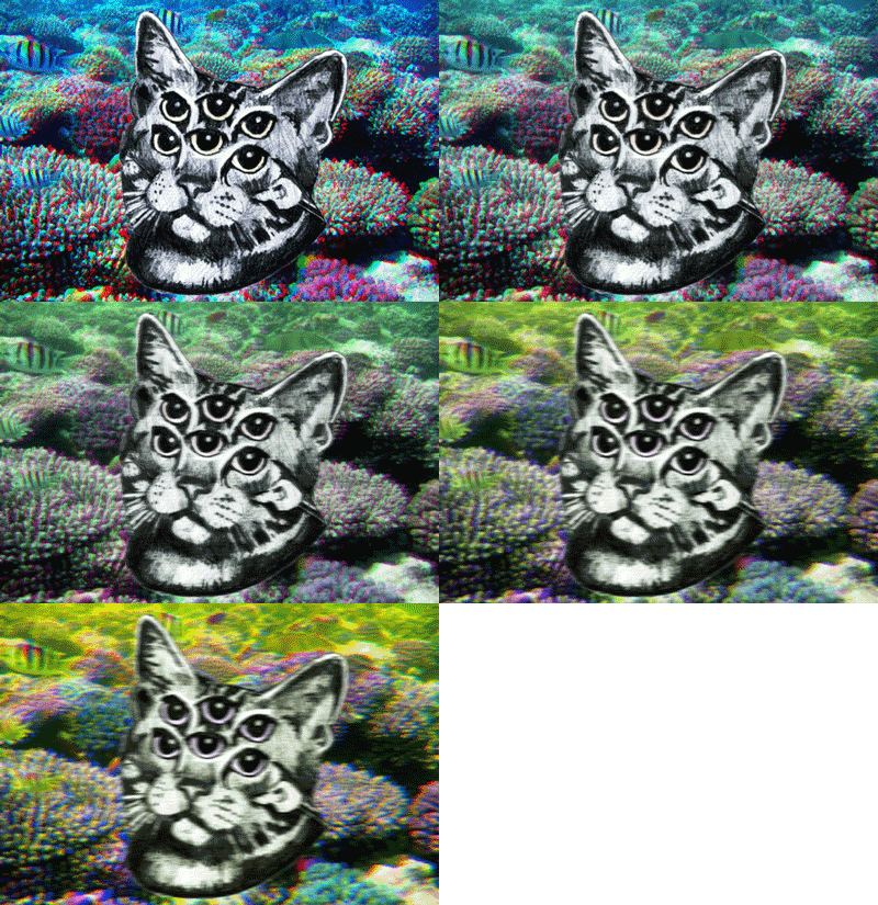
But seriously, just thinking and making doodles kick starts ideas. You can’t just sit around and wait for an idea, sometimes you just have to start with material and see where it takes you.
two words to describe John?
Jelly. Beans.
Curmudgeon. I don’t need two adjectives.
Picky. Old.
knick. knacks.
(editor's note: I keep including these, strictly for your entertainment, students.)
04 February 2013
Stereotypes in Design

I read an article on Design Shack written by designer and photographer, Joshua Johnson about how stereotyping could be helpful to design, the differences presented by masculine and feminine typography, and other important factors when determining a target audience. I was intrigued by his breakdown of type and design in terms of evaluation of patterns and characteristics. Johnson believes, “hitting a target audience often means leveraging some stereotypes.” He explains that , “colors, concepts, and typefaces all exist on a continuum. Often there is a clear masculine or feminine aspect to a design that defines its audience, although, there are many examples where a design lies somewhere in between the two.” Your job as a designer is to determine what you are trying to communicate and what elements you will include to influence your audience. A neutral state could possible be the best solution for the design you are creating so you can reach a larger, not gender specific audience, but appeal does not work in one finite way. Neutral is not always as strong of an appeal.
Many times we begin our design process with stereotypes as observations so we can better understand what a client wants. I liked Joshua Johnson’s example as he compares his design for Cesar dog food and Pedigree, pointing out that the designer should consider the kind of people who will most likely buy this food. He states many implications about the consumers due to their interest in a product and possible reasons behind their choices. Stereotypes are not always correct, but today there are so many types of studies about trends through media use and this can create a more accurate view of what certain groups of people are attracted to aesthetically.
We must define our purpose and then ask, is the design meant to attract a specific group or resonate with a much larger audience? Questions are key when talking to clients about who their message should target. The answers to these questions should affect your design before you begin to sketch out a single idea. It’s about achieving a set of goals and appealing to specific types of people. This should be reflected in your headline copy, typefaces, color schemes, imagery, etc.
28 January 2013
Mr. Wany

Mr. Wany
France 2012
Mr. Wany is one of many graffiti artists and designers that I admire a lot. His clean style using spray paint is very disciplined into making sharp lines and producing very clean work. Spray paint can control takes years and years to master. Using spray paint this particular piece uses several techniques to get different affects. Mr. Wany's work can be found in his blog and other blogs that I follow for inspiration with street styles, for example Ironlak is a big blog that I follow almost daily. I appreciate the art of graffiti very much as well as other forms of art that have enough pop and detail that can easily catch my attention.
Hip Hop culture brought to us talented artists that go against there city, there families, and authority to make us look at public expression. Painting in the darkest of nights and still being able to understand their colors is incredible. If graffiti hadn't happened we wouldn't be able to see work like this or influential work from varying artists and designers. Thank you.
Subscribe to:
Posts (Atom)