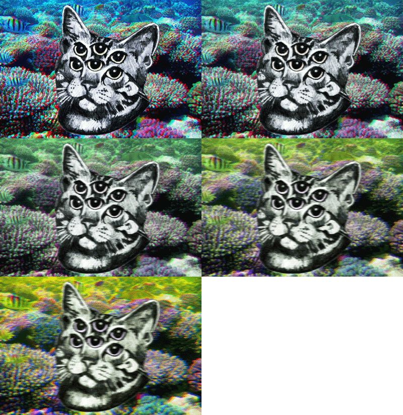
For my research this week I decided to focus on color, in particular how to use it and what you should avoid doing with it. Color can have many effects, from drawing attention, to setting a mood, or even reinforce recognition of something. As we start out life babies are typically interested in color more than form, however that begins to change as we mature and assign meaning to form. However, color still remains a dominate force in perceiving messages. We can start understanding color by understanding the color wheel. As most probably know, there are three main colors (Or primary colors) and these are red yellow and blue. You can combine two neighboring colors to create tertiary colors. When working with color pairing it is important to note the saturation and value. Saturation is how much grey or lack of grey a particular color has in it, the grey usually results in the color either looking muted or bright and vivid.

There are a few basic rules of color pairing. The first is that colors combined with their various shades look good together, this scheme is known as monochromatic. Another color scheme is known as analogous. This scheme follows the rule that colors like to hangout with their neighboring colors. These color schemes are harmonious because they all have the same undertone. For example, if you wanted to have a blue dominate scheme you could use colors like purple and teal. The last rule is that of complimentary colors. Colors look good when paired from the opposite side of the color wheel, effectively opposites attract. When pairing colors it's important to note the undertones though. For example, the reddish orange of a terracotta pot works well because it has a yellow undertone causing the different colors to blend harmoniously. However, you don't want to pair an undesired undertone with a compliment. For example, combining a brown with a pink undertone with a green will look awful.

It's also important to note how colors interact with their environment. Take the example to the left, the two lines are both the same color. However, they appear to have a different hue to them. The box appears to be lighter than the line on the bottom. The bottom line is completely surrounded by white space, so naturally it pops out and appears much darker then the thick block. Colors tend to be intensified when placed next to opposites or different intensities. So a dark color placed next to a white will look darker, and a lighter color will look brighter. A neat trick is to encase a lighter color with a darker shade. The darker color emphasis the encased color and keeps it from spilling off to the rest of the composition.