This is a unique approach to packaging design because in a
lot of cases, the packing of a product is disposed of and that is the end of
the design. The idea of combining a product and its packaging design helps
continue to advertise for the company. If people like the old-fashioned look of
Broadbase’s designs for Tala, then they may continue to buy products from Tala.
Something else interesting about the design is the company looked in the Tala
archives and used that is inspiration for the early 20th century
style of these products. They were brought up to date with modern day printing
technologies. I like the idea of taking an old style and bringing it back by
putting it on something that is used and seen on a daily basis. I kind of see
it as being able to interact with the past. I have also attached a link to an
online kitchen store that sells Tala products if anyone is interested in
looking at more of their products. Here is a like to Broadbase’s home page, also.

I explored Broadbase’s website and came across another cool
design sample. It is for the Treasure contemporary jewelry exhibition that
takes place at the Somerset House in the UK each year. The Somerset house is a
venue and it was Broadbase’s job to create designs for the jewelry exhibition.
Based on the photography of the event and a short video about the exhibition, I
think the design company captured the beauty and elegance of the modern jewelry
displayed in the exhibit. The use of swirls and script text creates the sophisticated
feel of the event but the use of bright colors makes the design feel fun and
fresh. In their description of the project, Broadbase explains that the color
theme changes each year. It is a plus that the logo and design can change while
still retaining the identifiable traits that make it unique to Treasure. Here
is the link to Broadbase’s page on the exhibition.
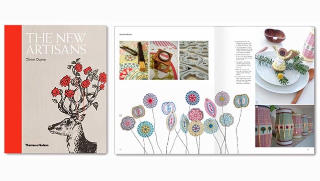
The final example of design I would like to show you is of
an arts and crafts book Broadbase designed. The book is titled The New Artisans
and is by Olivier Dupon. I found out about this book when I clicked on shop in
Broadbase’s website menu. It features current artisans and talks about their
craft. Here is a link to a different blog that features the book. I like the
use of simple layout and an emphasis on beautiful photography. I think
the cover of the book is eye catching with the red spine and illustration of a
deer with roses. Also, the use of white text against the grey background helps
the book stand out. Hopefully I can get my hands on this book someday! It looks
like it would be a lot of fun to read.