Logo Design Love is a blog devoted solely to the creation of
logos. I discovered it a few months ago and found it really useful in
explaining the process of logo and brand creation.
Although most of us have not created a lot of logos before,
it provides inspiration and ideas for what will make a logo successful
and timeless.
One section of the website I find really interesting is the
evolution category. Here multiple examples are given of how logos have changed
and developed over time. It’s interesting to look through because most of the
logos have become more simplified overtime to have a cleaner, streamline look.
One example showing this is the Kodak logo, which is no just the name in red
letters, where before there were more design elements to it.
The blog also has a category of humorous logos, where logos
are mocked or displayed in a way that is a playoff of the original.
It’s funny to see how some logos are so similar to others, which proves how
much research should go into designing one so that it does not copy another
company.
There are so many categories within this website of different
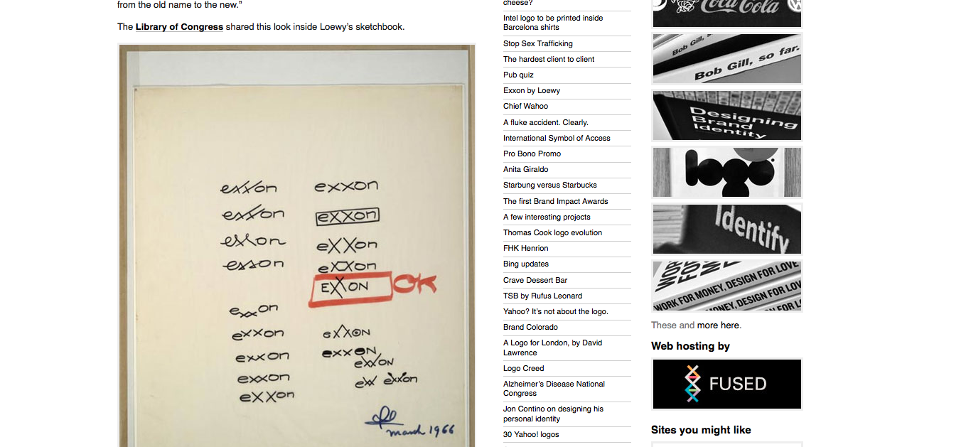
logos and processes. They have a section devoted to the sketch process behind
certain logos, one with interviews and information about successful logo
designers, and even logos focused solely on negative space. I think that it is
a really helpful website to look at when starting to create logos and branding
for something because it has so many examples of what to and not to do. http://www.logodesignlove.com/


Wow, this a great website! I especially like it because I too may be doing logos in the future, so this offers some insight as to what you can or cannot do, and it helps to show some of the process that went into a few of the well known logos. I even looked up at the sketches category for Firefox and even just the preliminary sketches were amazing and diverse in form; some were geometrical, others were more organic or realistic. I also liked the humorous touch to some of the logo combinations, even if they weren't intentionally done that way it's pretty clever.
ReplyDeleteIt's really nice to see there is a collective website of logos going beyond just how a logo was made. I really think the humor of logo shows a community side to logos as they make logos not just a graphic design or work concept but an actual art.
ReplyDeleteI simply adore some of their posts, I've browsed on that website since 2009 and they have never lost my attention. The meticulousness in the typography and artwork in some of these logos are simply astonishing, but often people won't notice unless they visit websites like these and read these "behind the scene" descriptions.
ReplyDelete