31 January 2013

What Font Should I Use?


            I found this awesome article on Smashing Magazine called “What Font Should I Use?” It has some key points & reminders for graphic designers when choosing fonts.  First off a little bit about Smashing Magazine; It is a website that publishes articles mostly on web design, but is not limited to, for designers to come & read for some insight.  I find it very useful not only to just browse articles & see if one appeals or applies to you but also to search for examples for your own inspiration.  There is also a breakdown of subcategories in the left column of the website if you want to browse particular areas of design.  I think this website is another great reference for any designer for inspiration or insight into parts of the design world.
            Now about the article “What Font Should I Use?”  I think this article is a good reminder for designers of how & why we should choose the fonts we do depending on what it is for.  I thought one good point was how designers need to know the types of font families (geometric, humanist, old style, transitional, modern, and slab serif) in order for a better understanding & application of these fonts to our work.  I think as designers we a care more about the feeling & mood the font conveys(which don’t get me wrong is important) for the particular piece & forget the importance of having a fundamental understanding of the fonts structures as well.  This is also important for the next point they make with mixing fonts.  I like the key part of this point: “keep it exactly the same, or change it a lot.”  Sometimes it can be challenging deciding which fonts to mix together & why.  This fundamental point is always good to have as a guide in the back of your mind when placing fonts together.  Overall I think this article is a very useful reminder of the basics of choosing fonts & is a good reference that I think designers should reread from time to time to keep themselves in check!

30 January 2013

Lines in Composition


When we look at an image our eye is naturally drawn to follow a line.  Thinking about how you place images in a composition can effect how we view the picture and how we are pulled into the image towards the subject.  It can take us on a journey.  

1. Vertical Lines:  Vertical lines run up and down.  They create a feeling of strength, grandeur, height and dignity.  Vertical lines can be found in buildings, trees, fences and people standing up.
2.  Horizontal Lines: Horizontal lines run across the image.  They create a sense of calm, peace, tranquility and stability to an image.  They can be represented in nature such as in flowers in a field, ocean waves, desert scene, lake or a person lying in the grass.  It is important to make sure these lines are straight or it will cause confusion in the image.  
3.   Diagonal Lines:  Diagonal lines run catty corner across a page.  They are the most powerful and create a feeling of energy, motion and force.  Examples of this are the slope of a mountain, a runner on the starting line and the wind bending a tree.
4.   Curved Lines:  Curves represent beauty and charm.  The best example is the female body.  Other examples are curves in a rive or a pathway.
5.  S Curved Lines:  An S curve adds interest and beauty to the image.  This line goes further than a plain curve and it adds charm and strength.
6.  Leading Lines:  This is a line that leads the eye down a path to a main object or center focal point.  Examples of this is a road, fence, shoreline or river.  The best leading lines will begin at the lower left of the image but not in the exact corner.  The eye likes to be lead into an image and it helps it get into the image easily.
7. Implied lines:  These lines are not actual lines but are implied.
8.  Unsuccessful lines:  These line of course do not work but they lead the eye into the picture and right back out with nothing to stop the eye.  There is no focal point to the picture so it is confusing to the eye. 

28 January 2013

Alternative Movie Posters

A really interesting site I found while looking around, is Alternative Movie Posters.  It's collection of various remakes of classic movie posters, in some really different styles that are all created by just regular people.  So some are a bit lacking in quality, but for the most part there are some very interesting takes on poster designs.


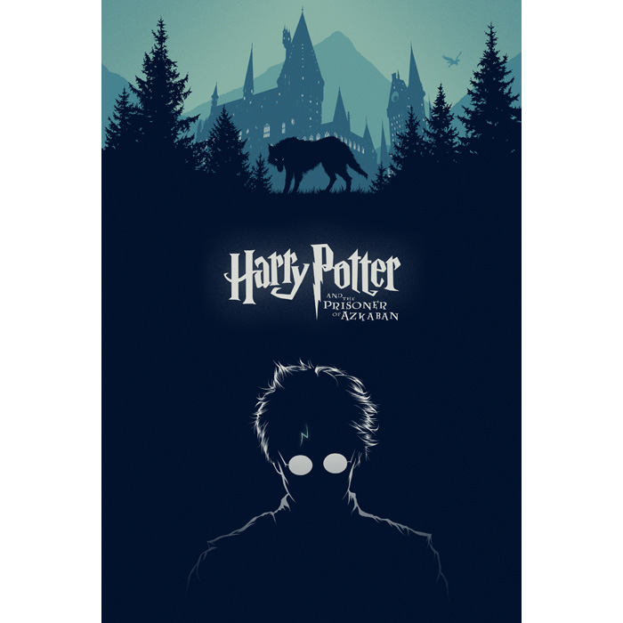
This is one that caught my eye while I was browsing, and I absolutely love the minimal style that they used.  There's a nice bit of contrast with the solid blue and white outline of Harry, compared to the very simplified yet lighter colored Hogwarts at the top.  It's designed in such a way that perhaps even people who aren't familiar with what Harry Potter is might understand it.  Although they may think of it more as a werewolf flick than one with witches and wizards.

That aside, there are many other really interesting posters I've found on that site.  Of those I've found, my favorites tend to be the very simplified sort of style.

Non-Vintage Vintage

Not so vintage, vintage clothing

I first came across ModCloth when I was spending countless hours on Facebook, as I am sure we all have done before. ModCloth was founded by a woman named Susan Gregg Koger, who had amassed a collection of vintage, one of a kind pieces of clothing throughout high school. By the time she entered college she had so many pieces that she and her boyfriend decided to create their own company. Throughout college they stayed in a home that served as their living space and office. Now the company has over 275 workers and Susan still travels around trying to find one of a kind pieces.

I have always been interested in fashion, mainly focusing on bringing back the clean lines and more modest cuts of days gone by. While I try to focus on the simpler designs, sans prints or an over abundance of ruffles and the like, I love the way that their designs are executed. While some of their use of patterns, to me, can be overbearing, how they use the clean lines of the actual piece as a whole to balance it out is brilliant. Compared to past fashion trends I have to say that this one, the reinstatement of retro looking garments, is perhaps my favorite.

But! So long as its used wisely. Because frankly I see people walking around that have layer, upon layer, upon layer, upon agonizing layer of patterns and vintage. I mean, I get it. Vintage is something that you can make look your own and adds something to any wardrobe. But its meant to be used in moderation. One interesting piece will go much farther than overloading and causing chaos. I use ModCloth as a sort of channel for inspiration. No matter when I check the site there's always something new, but it keeps with the style always. ModCloth mirrors my own fashion sense and designs. Moderation is key.

The Strategy of Branding

Branding is very important in making a product or company well-known. According to the AMA (The American Marketing Association) branding is a name, term, sign, symbol or design, or a combination of them intended to identify the goods and services of one or a group of sellers and to differentiate them from other sellers" (Lake). 

The important features of assuring a successful brand are: 
  • Making sure your brand's message is clear
  • The brand is achieving buyer motivation
  • Creates user loyalty with future products that the company may have
One company that highly succeeds in branding would be Apple. "Apple has redefined branding by blurring the lines between product and producer" (ABT). Apple tends to incorporate their products with their advertisements with slogans such as "I'm a Mac" for their mac users  or "Think Different " for the crazy ones, meaning that Apple's products aren't for the corporate person/suits and ties, but for the creative ones who are outside the box. In terms of product loyalty, Apple accomplishes this more than any other company. Their consumers like to integrate their design and keep to only a few products such as five or six rather than hundreds like their competitors, hence simple design. If their consumers have a Macbook, they are more likely to have an iPhone, iPad, etc. as well. Their products are seen or presented as "revolutionary" and people desire those types of products.
   
Apple has become one of the most successful companies in the world and is a huge power house in technology. Apple products have come to be a 'must have' and the company has continued to reinvent their branding image for many years.


http://www.arbitragemagazine.com/topics/business/apple-brand-products/

http://marketing.about.com/cs/brandmktg/a/whatisbranding.htm

Street Art Influence on Graphic Design 5644

 Since I was 16, I've had a huge draw towards street art and graffiti. The medium has grown immensely in the past decade incorporating several real life issues into street art to educate the public in a more "hands-on" way with politic and coroporate issues that may otherwise go unseen. I often feel cliche mentioning that my favorite street artist is Banksy, but his work is so original and fascinating and conveys some of the deepest meanings that street art has ever seen.
Now that I am working in the graphic design field, I find myself pulling inspiration and stylistic elements from street art into my projects. I enjoy the simplicity and bluntness that street artists use to get their point across and i often try to incorporate the straightforward attitude into my design pieces. I recently read this article which interviews Australian street artist/ graphic designer, Water, and I found a lot of connections in the way he describes the relation between his two passions. I hope you guys find a little inspiration in not only the article, but Banksy and the street art style as a whole. (If you find this interesting, I HIGHLY recommend the documentary "Exit Through The Gift Shop")

Packaging Design Inspiration: thedieline.com


The Dieline is a website, founded by Andrew Gibbs in 2007, which showcases the latest in the world of packaging design. It features a dynamic design which allows visitors to view the site in either a blog or grid format. Several new articles are posted daily, and archives are searchable through categories such as industry, features, and substrate which allows people to find a product design based on a specific material, industry of origin, or type of article.

The design of the website is the perfect frame for all of the content. Article topics range from industry news, to innovative ideas, to student designs. The volume of content they've accumulated from featuring several designs a day since 2007 has created a very comprehensive archive of diverse, well-designed products. It would be a great source of inspiration for anyone in the field or anyone who aspires to be in it. The Dieline also accepts reader submissions, so it's a great way to get something you've designed out where it can be seen. It's an impressive website and I would definitely recommend anyone interested in packaging design to check it out.

Source: http://www.thedieline.com/

DeviantArt

 
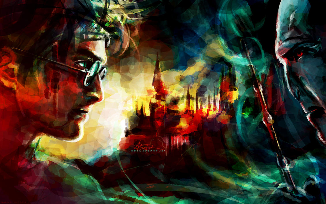
This image is from one of my favorite websites called DeviantArt. This composes of my different kinds of art work from many different people. Its pretty cool to see everyone's artwork that they have done even I'm not a member of this site (but you can be if you want). Plus, there are plenty of categories inside. Whatever you're looking for someone has done it in a some way.

Seriously, you can find just about anything hear It also gives me ideas on what to do with either projects or if I want to just draw something one day. Its kind of heavy on the cartoons but if you don't mind seeing a lot of cartoons then I recommend you check it out. I pulled this image of their "digital art" page. I really like this image mainly because it shows the final fight between good and evil which I really enjoy seeing these kind of things plus it looks pretty cool so its just a bonus. Here's there link to the home page:  DeviantArt

"DeviantArt holds the distinction of being the biggest social network website for both artists and those who support and enjoy it. The site has a rather impressive 13 million members and hosts about 35 million visitors every month." - Social Network Sites Review  

http://alicexz.deviantart.com/art/It-All-Ends-Here-202876825 

Minimal Movie Posters

One of my favorite design blogs out there is Minimal Movie Posters. They have some great and even inspirational pieces. It's very refreshing to see your favorite films portrayed in the simplest terms, using no photography. This example is one of my personal favorites:


Those who have seen the Star Wars movies will instantly recognize this scene - Tatooine's sunset, with its twin suns. Using a few simple shapes, elegant type, color, and texture the designer has successfully depicted an iconic scene from this film and created that association. I think this is really great minimalist design and serves as a good poster for the right audience. However, people other than Star Wars fans would have a difficult time understanding this poster, which is why not much of this design is used commercially. I find that I don't understand posters on this blog for movies that I haven't seen, which is perhaps the one flaw.

Color Inspiration: This Extension Might Just Make Your Design Memorable

Graphic designers live and die by color. A good color scheme can be the icing on the delicious cake of a good design, but a bad one could devastate even the best-composed piece. That's why choosing colors for a piece can be as nerve-racking as it is essential. If you're finding yourself in the midst of a color catastrophe, Adobe's Kuler extension may just save the day, and it's probably already included in your copy of a CS6 program.

Whether you're in Photoshop, Illustrator, or InDesign, just check the Window menu under "Extensions" for Kuler. If you don't have it, you can also browse and create using their free website. The process is effectively the same whether you're using the app from within CS6 or online, but I recommend launching it from CS6 so that you will be able to seamlessly add any color schemes you find or create into your swatches panel.

Kuler's slick web-based interface

Once you get started, the process is simple: you can search keywords, browse the latest and greatest themes, or take inspiration into your own hands with an intuitive color wheel that lets you set rules and create a beautiful design with minimal time and effort.

My five-second color scheme using Kuler's wheel

If your design is looking drab and you think the colors may be to blame, spend some time on Kuler and see if you can't find a theme that brings it to life. It's saved my life time and time again, and I hope it helps you too!

Concept art


       Concept art is the corner stone of any project, and often (at least to me) is the most interesting part of any project. It often shows the viewer the intent/feel of the project as well as setting forward the overall design/look of the project in question. While any particular studio or company often only employes 2 or 3 concept artist at a time for a single project the pay of is quite nice, the average salary of a concept artist is in the 72,000 range. As far as skills are concerned for a basic concept artist are overall great drawing skills, still life, life, perspective as well as painting.  And the ability to take what they create by hand and then turn around and scan it into a computer and improve it even further. Concept art covers the entirety of any project from the setting/scenery to the props and characters.

Computer Generated Art

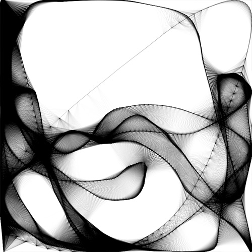
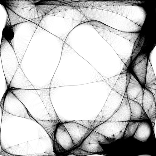
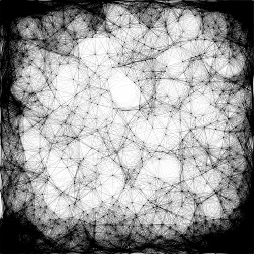
Can computers make art? Technically no; computers are unable to derive anything creative on their own, but they can produce really cool things if fed the proper information. For instance, when you plug in a numeric formula into your Ti-83+, the calculator will display a graphical representation of the given equation. If you alter the values slightly and repeat this a few times, you might get a pretty cool looking image. This is exactly how computer generated art is produced. It is up to the artist or user to come up with unique formulas in order to create stunning visuals like the ones below.

1.
keithpeters1
2.
keithpeters7
3.
keithpeters4

A man by the name of Keith Peters is responsible for these incredible designs. He uses a scripting language called ActionScript 3 to pull off these particular designs. Unlike the calculator example I gave earlier, Peters had to tell the computer exactly how to handle the desired commands in a more linear perspective. By doing so, he is able to achieve a more three-dimensional field of view. Although this style of creativity is less applicable in the designing business, it looks very interesting to say the least.

Designer's Blog: Keith Peters

UC Logo


Last winter break, I was reading an article about the UC logo redesign (left-old, right-new). There's some controversy as to the necessity of a new design and its intended purpose. The new logo was designed by UCs graphic design team and was to show up on their website and other documents but the original seal would be used on legal certificates. This didn't sit to well with UC students and alumni apparently as they were concerned it didn't accurately represent their school.

Not going to the school I couldn't really say how effective it is in such things but as a designer my only problem with it is that its just not very well designed. I can see potential with it in interactive media like a website though if it just used the golden "c" with some calligraphic logotype. As it stands, it is pretty ugly in my opinion. What do you think?

TRAVEL magazine page layout


Sorry about the huge image everyone.. but I figured it was cool enough that you wouldn't mind.  For awhile now I've been absolutely infatuated with magazine page layout.  I found this on pinterest.com, originally from behance.net, showing off the outstanding layout of TRAVEL magazine.  I'm pretty sure it's a foreign magazine because its been really hard to find, but the post on behance said this...

"TRAVEL magazine has been designed to show modern perspective in travelling. It focuses on well-designed spaces and creative way of showing popular landmarks. Vivid colours, strong typography, unconventional form of layout and dynamic pictures in large format make TRAVEL looks like an album that you can put on your shelf."

I love this layout both because of its visual appeal, and because with that, it also has functionality.  I like the fact that each page is slightly different, although they stay with similar themes of bright colors, treated pictures, large headlines, and interesting shapes for call-outs and added features.  You can tell the magazine has an overall design theme, although they seem to lack a universal grid or template.  However, I don't think that's a bad thing.  I think this magazine shows that you really can think outside the box when presenting print information, without actually taking away from what it's saying.  

Mr. Wany


Mr. Wany
France 2012

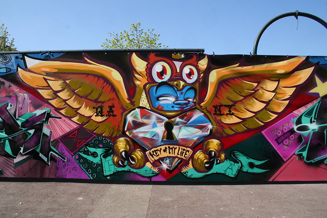
Mr. Wany is one of many graffiti artists and designers that I admire a lot. His clean style using spray paint is very disciplined into making sharp lines and producing very clean work. Spray paint can control takes years and years to master. Using spray paint this particular piece uses several techniques to get different affects. Mr. Wany's work can be found in his blog and other blogs that I follow for inspiration with street styles, for example Ironlak is a big blog that I follow almost daily. I appreciate the art of graffiti very much as well as other forms of art that have enough pop and detail that can easily catch my attention.

Hip Hop culture brought to us talented artists that go against there city, there families, and authority to make us look at public expression. Painting in the darkest of nights and still being able to understand their colors is incredible. If graffiti hadn't happened we wouldn't be able to see work like this or influential work from varying artists and designers. Thank you.

27 January 2013

3 things to avoid in Infographics

I thought this would be appropriate to share in this blog due to our upcoming Project 1. I found this while Stumblin'. This is three common mistakes we should avoid in info graphics  This is from a graphic design blog in India. This will help us all out on this project due to the fact that some of us might be confused or lost on what our info graphic should consist of, so here it is! Enjoy!

INTERVIEW: Jonny Black, Cast Iron Design Co.

                                                                                                                                              all images are copyright CIDCo.
 
JONATHAN JAMES BLACK, Graphic Designer // Cast Iron Design Co.
I’m co-owner of the Cast Iron Design Company in Boulder, Colorado. The company was founded in 2010 with myself and my business partner Richard Roche. I received a BFA in Graphic Design from Minnesota State University, Mankato, and an MFA from the University of Arizona.


SCHOOL

what type of internship/s did you do? any recommendations for landing an internship? 

I didn’t have any design internships, but I worked two different prepress jobs that gave me a lot of experience with print production.

what did you do once you graduated college? 

Moved to Boulder Colorado to run the business full-time.

when did you decide what direction you wanted to go in with your career? 

I knew I wanted to be a graphic designer when I was 15, after designing shirts and a website for the band I was in. It was a really shitty band, but I’d like to think we had above-average graphic design.

other than design courses, were there particularly interesting or beneficial classes that you took? 

Photography and printmaking.

any advice for student designers getting prepared for the design profession? 

Everyone always says this, but it’s absolutely true: work your fucking ass off.

did you feel prepared coming out of school to work where you are now? 

Very. But since I went to grad school I was in college for a total 7 years, as opposed to four for most.

what, if any, are the benefits to getting your masters? how valuable was your grad experience? 

My graduate experience was awesome and extremely nourishing. I highly recommend it. I became a much better writer, more intelligent, and of course improved my design skills. The shitty part is that I’m in a lot more debt, but it was definitely worth it.

what is the best advice you can offer a VC senior? 

Work your ass off and constantly feed your obsession with design. Otherwise you’ll probably get a shitty job working prepress, cropping shitty photos and watching the clock all day.

is it better to have a physical portfolio or a digital one? 

Get a website. Cargo Collective is probably the best/easiest format right now.

what was more useful, school or on the job experience? 

School taught me more, but I learned a lot working too.

will specializing in a single area of design be helpful or hurtful as a graduate? 

It’s okay to specialize in a single area (for instance if you love making posters, make a shit ton of posters). That being said, you do need to be able to show how you can translate an idea/brand across multiple platforms, so stop making posters sometimes and do other stuff.

do you format your portfolio to cater to the place you are applying? how do you decide what to include and what to omit? 

Include your best. Less is more. Sometimes we see a portfolio come in from a student, and there’s a few good projects and several shitty ones. The should’ve just sent us the three good ones. Edit.

does the addition of a master’s degree help in getting work? if so—how important? 

I can’t say exactly, since I didn’t apply for jobs, but it probably wouldn’t help that much in terms of landing a job. Your portfolio is what counts.

what experiences from undergrad helped you to succeed professionally? 

My mentor. I had a design professor who gave a shit. And pushed me.


WORK

where did your company name come from? can you elaborate on your Cast Iron identity? how did it come about/develop? 

The company name came from my own cast iron skillet, and I thought of it one day while cooking. Here’s the full explanation from our site:

The name Cast Iron Design Company refers to the classic cast iron skillet. The timeless, efficient, and functional qualities of the cast iron skillet are all characteristics we strive for in our design work. Cast iron skillets are heirloom objects, often lasting hundreds of years, passed down from generation to generation. They are made of a singular material (iron) which is relatively simple to melt down and use to make something else. Cast iron cookware leeches healthy doses of iron into your diet, in contrast to contemporary cookware which instead leeches traces of carcinogenic teflon. We’re also quite fond of the connotations people have with a cast iron skillet, such as memories of grandma fryin’ up eggs & toast for breakfast, lumberjacks cooking a stack of flapjacks over an open fire, or old fashioned wives chasing their nar-do-well husbands out of the house.

can you talk about Cast Iron’s commitment to sustainability? 

From the site:

Green design is about getting more out of less—less materials, less energy, less water, less waste, less carbon emissions, et cetera—in order to minimize environmental impact. We carefully consider our options in order to produce the highest quality finished product with the smallest environmental footprint. There is a common misconception that green design equates to higher costs, which isn’t always the case. Often, green design solutions end up saving money.
We believe that considering the environmental impact of a project is an essential facet of any good design solution. Our approach to green design is research-based. Take for example, paper. Though paper may seem like a simple material, it’s a surprisingly complex subject. Choosing the best option requires careful research for each individual project. We work with clients, manufacturers and production specialists to consider the environmental impact throughout all stages of the process, extending beyond the traditional role of designers.


what motivated you to become a ‘green’ designer? does the cost/expense of your work increase by going green? 

I was a “budding” environmentalist before going to grad school. One of my professors had a class about social and environmentally conscious design, and I connected the two. After that, my role as a designer had purpose. No matter the budget, you can always find ways to be more conscious of your environmental footprint. If you’re interested in green design, I highly recommend Green Graphic Design by Brian Dougherty.

how many years did it take to start your own company? what was the basic process for starting? 

To get everything set up (website, legal stuff, etc), it took about six months.

what are the best ways to get work? be seen? advertise yourself? 

Do something creative and unique. Make something awesome that will make you stand out from the rest of the students who are trying to get a job.

which clients do you tend to work for? which ones do you avoid? 

We work for a lot of different businesses, mostly small businesses, and we’re very lucky to have every one of them. We avoid clients who seem like they’re assholes. You’ve got to trust your gut.

how do you find a steady stream of clients? 

We don’t. There’s an ebb and flow to things. Sometimes we’ll get five inquiries one week, and then zero for an entire month. We’ve never advertised, and most of the inquiries come from our website (which has made it onto a lot of blogs) or word of mouth (referrals).

where did you meet your partners? 

My business partner and I met during undergrad. We had good design chemistry, and even more important, good personality balance.

most difficult job/project you’ve had to complete? 

Personal website, hands down.

how do you deal with the pressure of deadlines? and how fast are real-world projects compared to college projects? 

I deal with it by using it as a tool. Deadlines push me. Make me focus better. Make me stay up late and work into the night. Deadlines—although they can be a huge bitch—are your friend. College projects are always fast. Real world projects typically take months, but every project has its own pace.

what is the best way to understand, precisely, what a client wants? 

Listen. Then reiterate it in your own words (we develop word lists with clients).

do you ever do any free work, just to get your name out there? 

I used to do a lot of free work, as its a great way to get experience as a student. Volunteering my design skills for school clubs, that kind of thing. But now I can’t afford the time because free work isn’t free anymore, it means I’m losing money. And we’re not exactly rolling in it. I’d say the best way to promote yourself is to create a website and look for small design jobs on craigslist. That’s what I did and it was a very valuable experience.

what was your first paying project/gig? 

Stuff for my band when I was 15.

how often are you forced out of your own style to please clients? 

Although our website (which is about two years behind) shows a very vintagey style, we only use that “style” when it’s appropriate. We make our design decisions based on what is appropriate for the project.

what are a project’s typical time-window for completion? how many different projects do you work on at once? 

Time always differs based on the project’s components. With the two of us we can handle about five clients at a time, but prefer about three.

what do you do regularly to advance your career? 

Read about design and look at design. As a student, one of the most important tools for becoming a better designer is to look at and analyze design as much as you can. Get a google reader account (or an RSS reader app) and start subscribing to RSS feeds of your favorite design blogs.

what skills would you say are most important? 

Be flexible. Show you have range. Range in visual execution, as well as range in design mediums (interactive, print, environmental, etc).

do you modify your look/style to meet the customer, or do customers come to you for your style? 

From time to time we do have clients come to us for our “vintagey” style that’s showcased on our website, but we usually turn those people down if we can. Our design solutions are based on what’s appropriate for the customer (ex: fun/serious/modern/contemporary/vintage).

when did you start your business, and what challenges did you face initially? 

The only real challenge we have with the business is money. It’s the shittiest part of owning a business. Everything else is great. Our ongoing challenge is being efficient. We spend way more time on projects than what we’re paid for. That makes for great design, but not great business.

do you often work alone on projects, or with a team? 

To some extent, Rich and I always work together on projects. We’re much better that way, even thought it’s time consuming. We’ll hire others when necessary but it’s pretty rare. We prefer to do everything ourselves.

how do you know what to charge for a job? 

It’s a balance of how much money we think the client has, and how long it will take us. There’s no real formula, and every designer struggles with how much to charge. Jessica Hische wrote a great article about it on her blog, look it up.


PERSONAL/DESIGN PROCESS

why did you change the typeface used on the questionnaire document? 

I wasn’t exactly looking forward to spending an hour looking at Bembo Standard.
editor's note: I'm using Helvetica on the blog regardless. So no Bembo, and no Supria Sans. But the font thought is appreciated.

what is the one thing you struggle with the most? 

Business-wise: making money. Personally: being efficient and staying focused. I waste an incredible amount of time on the internet, mostly looking at cat gifs and stupid shit like that.

how do you stay inspired day after day? 

I don’t. There’s a natural ebb and flow, and I’ve learned to accept it and work around it. Sometimes I’m super excited about a project I’m working on, working extremely fast and efficiently. Other times, I’m in a lull.

which of your works/projects was the most inspirational to you? 

The best and most important projects I’ve worked on are projects I believe in. I’ve been very fortunate to work on a lot of these types of projects.

where do you find motivation/inspiration for personal projects? do you do personal projects? 

I don’t do as many personal projects now that I’m out of school, but the projects I’m working on professionally are exciting and nourishing, so it’s not really an issue.

what is your process for choosing a typeface? any favorites? 

I have a giant library of typefaces that I treasure dearly. My process for choosing type is to find the typeface(s) that resonates with the tone or feeling of the project. I have too many favorites to list, but H&FJ’s typefaces are the best in the world.

are there any cultures or countries that inspire you creatively? 

Cultures that put a higher priority on good design. The Swedes and the Swiss are two.

with what you know now, is there anything you’d do different? 

Not really. I’m very grateful for where I am and the path I’ve taken thus far.

what music to you listen to when working? 

If I’m designing, a lot of indie music, pre-80’s country, folk-ey shit, psycadellic rock, etc.

if you were to describe john in two words, what would they be? 

Italian Stallion.

how has your design style developed since school? 

Simpler and more modern.

what is your design process? 

Research: Learn about the client and the business. Find out what’s been done.
Brainstorm: Word lists, mind maps, mood boards, etc.
Sketch: Never skip the notebook. Something magical happens with pencil and paper.

are there any traditional, off-computer tools you like to use for design? 

A really nice pencil or pen, and a really nice notebook. Spoil yourself here and it will make sketching much more enjoyable.

what do you like about the medium you work in? have you always wanted to work in it? 

I love technology and I’m lucky enough to have a gigantic-ass 27” iMac. I love it. I also screenprint posters from time to time, which I absolutely love doing. The only other medium I would like to work in is hand-painting signs. Someday that’ll happen.

how much design work do you do in your spare time? 

In the very, very limited spare time I have, I’m outside or with friends. I spend 90% of my waking hours working.

do you prefer print work or web work? 

Print is my love. There’s nothing like that feeling you get when you receive the finished product. I designed my first book recently (not like some blurb shit—the real deal) and it was amazing to finally get that thing in the mail.

design you trust

This website and especially its pintrest and facebook sites are one of my favorite places to look for design ideas and inspiration. Every day they update this site with new and interesting designs. I'm always inspired by what they have to show. This star wars art caught my eye, so thats why i used it here, but there are SO many things to look at on the site. Its pretty amazing a lot of the things people can come up with. This is a great forum for new upcoming designers to show off their talents and their portfolios. Its full of new design trends, portfolios, articles, news and events, as well as photography, fashion, cool and creative ads, and interior design. Its hand picked designs from all over the globe. If you like them on facebook you wont regret it. It seems like every hour they post something new and exiting.

So check em out. I definitely recommend it. You will leave realizing that we all need to work a lot harder to achieve that level of amazing design. And it inspires me to want to. Sometimes there are tutorials as well that are really helpful. hope u guys enjoy!

26 January 2013

Dribble, the "Show and Tell" for Designers

As children we developed a love for show-and-tell. There was nothing more exciting than getting to take something you made, found, or loved into a classroom and show it to everyone else. Of course, if you were like me, you took a small furry animal because nothing insures 5 minutes of fame like a hamster.

Now imagine the best possible Show and Tell minus the creatures, autographed baseballs, and finger paintings.

It’s for designers.
It’s online (you can stay in your pjs and eat cereal while you browse).
It’s full of ideas.
It’s color-coded.
It’s addicting.
You’ve found yourself imagining Dribbble, the “show and tell for designers”. 


Lacking inspiration? Take some time and look around. There’s a “Sort by Color” feature, a “Popular” page, or you can just explore! Want to show off? Go right ahead! In fact, the community is made for just that. 

AND if you like something specific, you can always hire the artist (or be hired yourself)!
So if you’ve got a few minutes hours (let’s be realistic), or your homework doesn’t seem all that appealing, hop, skip, and jump on over to Dribbble.com!

Font Choice


            A friend of mine had been talking to me about this article, Hear All You People Harken O  Earth, for quite some time now, so I figured I would finally read it to get her off my back.  The whole idea of the article is that font choice can and does have a real world bearing on how we react, positively or negatively, to a written article.  This article is a little boring to read because of all the mathematical and statistical language, but still really interesting.
            I think that the most interesting part of the article is the part when the student is talking about how his font choice changed the grade he received on several of his papers. In total, he had written 52 essays. Eleven in Times New Roman, 18 in Trebuchet MS, and 23 in Georgia. Of the three font faces, the essays written in Georgia averaged a solid A, Times New Roman had an average of A-, while Trebuchet only averaged a B-.
            Although the previous example is purely anecdotal, the article does contain other studies and examples to bolster the idea that type face choice also carries with it a feeling or emotional value. This article will make me think twice about what font I use on my next term paper.