31 March 2013

Honey packaging designed by Tamara Mihajlovic


In light of the recent package design project, I just thought I would make us all feel bad about ourselves and show this amazing packaging!  But on a serious note, I saw this package design on behance.net and they have a description of their product which says
    "Our product is designed for special occasions, such as celebrating, birthdays and
various types of events, but also for more intimate moments with a loved one.
BEEloved honey, as well as our customers, is refined, sophisticated and intelligent & flirt
and interact with consumers in a smart and seductive manner."

I love this product not only because of the amazing packaging, but how passionate they are about their product.  I think this passion then really translates into the unique design of their packaging.  I think this shows that if we really get behind the projects we do when we get out in the real world and learn about them and form a connection to whatever that may be, then a really amazing result can be produced.  

Also if you want to see their whole process complete with logo design click here! http://www.behance.net/gallery/BEEloved-honey/7297839


Grafik Intervention Flagstaff


     This is a project we are doing in my VC370 class. I think that it is a great opportunity to use design to draw awareness to our own community and what is going on in the neighborhood around us. We found several buildings in the downtown area and will be creating these installations to display during the First Friday Art Walk in May. Follow us on Facebook at Flagstaff Grafik Intervention!
It was originally conceived as an MFA graphic design thesis project at the Academy of Art University, William Culpepper’s Grafik Intervention uses digital projections to engage the public through visually dynamic and compelling communication methods.
Projections are designed to provide historical information in an urban context. The goal of the projections is to inspire community members to consider the potential of currently unused buildings in their community.

Background
Thus far, five cities and over a dozen buildings have used the Grafik Intervention process to engage a community and create dialogue through graphic design. Previous interventions were performed by graphic designers and design students from across the country, as interest has increased, several more designers and students have expressed interest in implementing their own Grafik Interventions around the country, with several planned in near future.

Process
Buildings are identified and selected based on their abandoned urban spaces and potential for revitalization. Within each identified city, several case study buildings were carefully selected based on their notable history and location, in contrast to their current state of abandonment.

Projections
Each of the identified case study buildings are then thoroughly researched and documented. The content of the researched information about a building’s historical usefulness is then projected onto the building façade creating a juxtaposition, thus illuminating each building’s current potential.

Results
Digital and printed questionnaire cards elicit information from the general public as they pass by the selected case study buildings and become engaged by the dynamic projected visuals and the real-time discussions. The goal of the questionnaire cards is to engage the general public with a series of thoughtful questions that help evaluate the success, visual interest and communication methods achieved with the projections.

11 March 2013

Anthropologie House & Home Designers


Anthropologie is one of my biggest inspirations, not only because of the textile designs of their clothes and products but also the decorations and atmosphere they create in the store. Their website has a page about a featured artist and I have selected some of the products that stood out to me. 

The first image is a ceramic vase designed by Rachel Boxnboim. I love the texture and unique shape. Her bio explains, "Rachel sites her adopted city's [Jerusalem] cultural influence, which is evident in her ceramic method: she uses a kil to scorch away handmade fabric molds, revealing the porcelain within."  

The second image is a one of a kind, handmade chair by Slovenian artist Vanja Bazdulj. This chair is so creative and inspiring. I love seeing designs that are completely unique and unlike anything I've seen before. Vanja's bio says she is "inspired by everything from sea creatures to city life."

The last image is beautiful rug made out of wool, jute, and cotton backing by the talented designer Gordon Harrison Hull. He is "inspired by the rituals, mysticism and craft of Africa, his work is based on an aesthetic concept he calls 'lofic magic,' which explores instances of happenstance and the supernatural contemporary culture." The colors are amazing in this rug and I picture it in a large room with aged, white-painted, wood floors. I have never seen a rug with such an interesting shape. It adds so much to the design and feel. 

Here is the link to the featured artist page. I highly encourage you to take a look. These are only a few out of the incredible designs Anthropologie sells. 


Old-Timey Branding For Small Businesses

This article shows 14 examples of new logos with an older feel. Most of the examples are of small business logos, designed by designers all over the world. I feel like I have been seeing this trend a lot lately, and all these logos are very cool and well designed. I really liked the used of geometrical shapes in several of them. If you trying to design a logo this is a good place to look for inspiration.
Here are some of them:


And if you got some extra time check out A Projector and a Fog Machine Create Startling Visual Spaces. This is a very interesting and cool looking exhibitions, great environment design piece!

I love Typography


   I stumbled upon this website a while ago when researching some sign design stuff I was working on and this site has tons of amazing resources for typography.  The site has basically all the answers you would ever need for any typography type questions.  There are an endless amount of interviews posted with famous type designers and how to go about using the right typeface for certain jobs and even breakdowns of how to go about creating your own typeface from scratch.  The site also has a link to Codex Mag which is another awesome journal for typography.  I would definitely recommend this site if you come across any typography/design problems.


I Love Dust

     I recently discovered ILoveDust through one of my visual communications classes this semester.  I love all their work and the fact that they look like they have so much fun doing what they love.  They are a multi-diciplinary boutique that collaborates with major brand names such as RedBull, Nike and many others in order to create visually appealing designs for events and such.  Their style ranges from beautiful typography to incredible illustration.  I strive to have the same technique as them and look to them for inspiration on most of my projects.
    I urge you to give them a look! You may become just as inspired as I have become after looking at the projects they have excelled in.  Their work is truly amazing and can be incorporated into many projects we are assigned.  They even design packaging, which most of us are going through right now. Unfortunately they are located overseas, however, I believe this makes them even more inspiring.  They are spreading their work to the US and will most likely have a studio here in no time.  These are the type of people I hope to work for in the future, traveling to places like the US Open of Surf to paint murals and spreading my work to corporations such as Redbull.  These guys are truly an inspiration.  Go take a look at ilovedust.com.  You won't regret it!


SPOON GRAPHICS- Freebies, tutorials, and more!


While working on one of our many assignments, I wanted to figure out a way to texturize a logo in Illustrator. Thus far, I've only experimented with grunge textures in Photoshop, but the Brits at the Spoon Graphics Blog gave me plenty of help with my Illustrator endeavors! Not only were there 5+ tutorials covering different aspects of the design I needed, but Chris Spooner created a Vector Texture Freebie Pack that I could use and someday emulate on my own.
There are tons of detailed articles, and even more free packs that are really helpful! The tutorials are easy to read, and include great pictures to help you follow along. I feel like there are always tutorials online, but the amount of comprehensible tutorials is far more limited. If you need help with an effect, or creating a specific type of graphic, I'm sure Spoon Graphics has it! I know it will definitely be my first stop the next time I'm having trouble with something!

Beer Labels

Beer Labels

While browsing one of my favorite websites—Juxtapoz.com, I stumbled upon this list of "Top 25 Modern Beer Labels". I thought this post would be relatable to our Packaging project to those who need some inspiration.

http://www.juxtapoz.com/top-list/top-25-modern-beer-labels

Here's a couple I admire a lot. I like that handdrawn graffiti effect on these labels. I've never tasted them personally but the way it's presented would definitely entice me.


TeeFury


TeeFury, which I'm sure most of you are all familiar with, or have seen certain designs on other people's shirts and went "Holy geeze, I need to get me one of those."
    TeeFury is a website that has the most creative designs for t-shirts from popular shows, video games, and the likes. All these shirts are designed by people that have submitted their work to this website and have then gotten their design selected to be on a shirt and sold. The designs that are selected get paid from every shirt they get sold and get 24 hours of stardom.
    Not only does this website help designers or creative people get noticed, it shows how others have taken a creative look and thought outside the box about a popular trend. And in most cases have come up with a mash up of two popular things, like Zelda and Star Wars (as shown above). So whenever you're feeling lackluster or down in the dumps, you can get a few laughs from the designs at TeeFury, get inspired by some of the creative designs, or try for yourself and submit one of your awesome designs today!


10 March 2013

The Draplin Design Co. 50 Point Plan to Ruin Yer Career


Portland/CreativeMornings - Aaron James Draplin from CreativeMornings/Portland on Vimeo.

Aaron Draplin saved my week. I'm not sure how I'm going to make it through the next 5 days. It's going to be brutal. Luckily, I have inspiration from a new graphic design hero.

I came across this Creative Mornings talk that Aaron Draplin of Draplin Design Co. did and I was instantly inspired to keep trucking. Draplin is an insanely charismatic, funny guy and it is a joy to listen to him talk. Listening to someone that's worked hard to put themselves where they are is encouragement enough to roll out of bed, make the walk to the comm. building, and get ready for a full day of sitting in the computer lab.


Draplin brings up a lot of points that I already try to live by and it was cool hearing it applied to a graphic designers life. Things like appreciating where you come from, loving your friends, staying humble, finding and collecting cool things, supporting your local rock bands, and of course getting cosmic. I needed to hear this stuff to just keep rolling on because working hard and loving it will pay off one way or another.

The New PS4 Controller


So if you had heard Sony announced their new generation system on February 20th. The PlayStation 4, in my eyes has been longly anticipated since the release of the PlayStation 3. Although very little information was leaked about the new system, Sony has revealed that the system is scheduled to be release this holiday season with its rival, the X-Box 720. We have not seen the system its self but we have in fact seen what the controller looks like.


With this design Sony promises a better online experience with a "share" button on the top left and a light bar that can be used to identify players with color-coding. This blue light bar is also the link to the PlayStation camera that can track the pad for advanced motion controls.

All in all I like new controller design. It's a little more polished and a lot more interesting than the old controller. It's also great to see Sony deviate from the standard Dual Shock pad, smoothing things out and making the whole thing look a little fresher. I can't wait to get my hands on this and start playing some beautiful PS4 games!


09 March 2013

What NOT to do in Logo Design

I found another awesome article from Smashing Magazine that I think could be very useful for all designers called "10 Common Mistakes in Logo Design."  Although I have little to no experience in logo design (the only logo I "designed" my client had already sketched out what they wanted for me) I think it is good to know this tips on what NOT to do so if I do start log design I have something to go off of.  The hardest thing for myself in logo design is knowing where to even start, so maybe knowing where NOT to start and having this information in the back of my mind may be helpful.  Most of these tips have to do with avoiding the obvious, what others are doing, or what already exists in logo design.  I think overall what I can take away from all these points in this article is to make your logo unique, ordinary, and professionally fitting for the business it is to represent.
If you don't have time to read the full article, here are the bullet points they say graphic designers should avoid in logo design:
1. Designed by an Amateur
2. Relies on Trends
3. Uses Raster Images
4. Contains Stock Art
5. Designing for Yourself Rather than the Client
6. Overly Complex
7. Relies on Color for its Effects
8. Poor Choice of Fonts
9. Has Too Many Fonts
10. Copies Others

05 March 2013

Using Black in Print Design

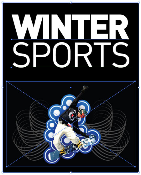
example-artwork-placed.jpg
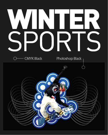
This interesting article covers issues that designers come across when attempting to print in black. Specifically it covers transitions from blacks used in Photoshop, to blacks used in Illustrator. In addition, this article goes on to explain the different ways those blacks are created, and which are best for fine text. The information here is great, and really sheds light on something most designers take for granted; black.

However; we have all had print designs where the printout looks much different than it did on the screen, and this article helps to explain why. In particular, I enjoyed the explanation of "warm" and "cool" blacks where you mix different components of CMYK. I will definitely be using this information the next time I go to print something.


example-artwork-reality.jpg

INTERVIEW: Christian Rice, Handsome


all work is copyright Christian Rice and Handsome

CHRISTIAN RICE, Designer // Handsome
Influenced by the emotive power of design on the human psyche, Christian Rice's contemporary style is clean, well-conceptualized, and accessible by all. After acquiring his bachelors in Philosophy from Queens College (Canada), and his masters in Visual Communications from the University of Arizona, Christian followed his aspirations to NYC, where he designs for Amika, and continues to grow his own company, Handsome Clothing.

SCHOOL
other than design courses, were there particularly interesting or beneficial classes that you took?
As a graphic designer you should be taking photography courses and a web design design class that teaches you coding. Knowledge of these, especially photography, is expected of graphic designers now.

As a person I would recommend taking philosophy classes. At the very least it will make you a better citizen of humanity. It has also been a constant source of inspiration for me.

what was the most helpful thing you learned in college? in your first year in the job world?
Learning how to present and speak about my work. The work should be able to stand on it’s own, but communicating the thought and process that went into it can make believers out of non-believers. It can also further solidify peoples position who believed in the work before you spoke. I’d recommend taking every opportunity to present and speak about your work in a school environment. It’s a safe place to make mistakes and actually receive feedback. After school, the only way you’ll know if you’ve done something wrong is if you don’t get a call back and you’ll never know exactly what you did wrong.

is it better to have a physical portfolio or a digital one?
If you really had to pick one I would go with digital. Every company I applied to asked for a URL to my digital portfolio along with my resume.  You need it to even be considered in the first place. However, I think it’s important to have both. I interviewed for 2 companies after I graduated. The first interview I didn’t have my physical portfolio with me. I didn’t get that job. The second interview I had it. I got that job.

what was the first step you took after finishing school to get into the profession?
First, I finished all the personal projects I had been meaning to. Then I took a few freelance jobs that would help fill out parts of my portfolio I felt were lacking.  The last thing I did was redesign my website and resume. I made everything look as current as possible and made sure to highlight my most important work and the work that I wanted to do in the future.

how did you feel in school? prepared and ready? intimidated? lost?
I think everyone feels all of these at some point.

what was more useful, school or on the job experience?
Get ready for the lamest answer ever... ready? .... both are useful.

You should think of school as a safe place. A place to freely experiment  and ask questions without worries about getting dropped by a client or not having enough money to pay rent. You have time to develop and learn new skills while in school. If you use school like this than it can end up being more useful than job experience.

will specializing in a single area of design be helpful or hurtful as a graduate?
I think at this age that it could be more hurtful than helpful. It’s nice to have one specialty that you really shine at but I think to find that you have to try a lot of things and see what stands out naturally. So many disciplines are expected of graphic designers now that I think you would really be limiting your opportunities by focusing on one thing. However, if you’ve spent a lot of time on one thing and it’s clearly where your passion lies, go for it; just make sure you are one of the best in the world at it.

how long after graduating did it take to find a job? did you need to relocate?
It took about a month from the time I started sending out my resume to when I was sitting in an office. I was always planning on relocating to NYC so I can’t really say if I needed to or not. I would imagine it did help with me finding a job so quickly though.

do you format your portfolio to cater to the place you are applying? how do you decide what to include and what to omit?
I didn’t format my digital portfolio. My goal was to show the best examples of work I had in each different category of design. So I made sure to have a couple posters, some websites I had designed, some logos, some t-shirts, some photography, type heavy work, illustration heavy work, more serious projects, some lighthearted ones, etc. 

I would recommend formatting your physical one though. It should be easy to tell what work would be relevant to a certain company. You shouldn’t walk into an interview without having a strong knowledge of the company and their past work. That being said, if you have a piece that seems like it is not relevant but you think is great work, you should leave it in. You never know when a company may be looking to expand into new territory.

does the addition of a master’s degree help in getting work? if so--how important?
I really can’t say but this is how I think of it... often times these decisions come down to two relatively equally qualified candidates. In these cases it’s always better to be the one with the masters than the one without.


WORK
what are the best ways to get work? be seen? advertise yourself?
I think the best way to get work is to make work. The best way to be seen now is the internet and make sure that work is being displayed on your website. Submit it to blogs and websites. Just ask for their opinion, if they like it they’ll post it.

which clients do you tend to work for? which ones do you avoid?
I tend to work for friends and friends of friends. I’m not a big networker so I tend to stay within my own social circle. I avoid people who keep flip flopping on what they want or like something of mine that I don’t. This is a good reason to constantly update your portfolio.

where did you meet your partners?
I met my business partner AJ in high school in computer class. We both hated our teacher and had no idea how to code. Our greatest achievement in that class was coding a Canadian flag that slowly moved across the screen. I remember us doing this but AJ thinks we failed at that project too.

did you apply for jobs based on where you wanted to live, or based on the job itself?
I applied based on both. I knew I wanted to live in NYC and I also knew my style and personality would only be appreciated by a certain type of company/person.

how do you deal with the pressure of deadlines? and how fast are real-world projects compared to college projects?
I have no idea how to deal with the pressure. Does curling up into a ball and rocking back and forth while crying count? I don’t know. Maybe I cope by having this feeling and then realizing how useless it is and moving on with life.

Real world projects are almost always faster than school projects. One of my teachers at the UofA would sometimes give us a project at the beginning of class and give us an hour to complete it and then present it to the class. I thought this was crazy and that it would never happen in the real world. It happens all the time.

what is the best way to understand, precisely, what a client wants?
Ask lots of questions. Ask stupid amounts. A lot of the time the client doesn’t really know what they want when they first approach you and by asking questions over and over it helps solidify what they want so you don’t have to do tons of redesigns. I always ask them to send me examples of similar things they like too. Visuals help fill in blanks that words can leave.

do you ever do any free work, just to get your name out there? what is the best way to promote yourself?
I did it for friends and charities. It’s OK to do it when you are just starting, especially if you have the time. However, I wouldn’t recommend it unless it’s for a charity or a cause you believe in. There’s a saying that “if you don’t value your time, no one will.”

how often are you forced out of your own style to please clients?
Often. It’s very rare that you’ll be able to do something completely your own. Even if it starts out that way they’ll usually ask for re-edits and changes that may go against your tastes. All clients want to feel a part of the process and that they’re being listened to. It’s not always bad though. Sometimes by collaborating, it will push you in new directions that you didn’t think of before and add to your design repertoire.

what are a project’s typical time-window for completion? how many different projects do you work on at once?
It varies a lot. I get everything from, I need this done in the next 5 minutes to spending months on one project. I’ll almost always have at least 3 projects going on at once.

what do you do regularly to advance your career?
Read and reread. It’s a cliche but it’s true, you’re not done learning when you finish school. I’m constantly trying to keep up with new styles, techniques, tools, language.

best route: applying everywhere or having connections?
You don’t need connections or to apply everywhere to get a job. I only applied to the jobs that I felt I was suited for and were interesting. I didn’t have connections anywhere. Before applying to a place, take an honest look at yourself and your work and ask yourself if you would be happy there, if you feel you belong there, and if you think you can contribute something to them. Chances are that if you really think you belong at a place, they will too.

do you modify your look/style to meet the customer, or do customers come to you for your style?
Clients that have contacted me did so because of a certain style. I’m happy to accommodate different styles though. I always look at it as a chance to expand my skill set.

do you often work alone on projects, or with a team?
Alone. Like Sarah Palin I like to go rogue. Wait... I’m not like Sarah Palin in any way. Maybe I should start working with a team..

how do you know what to charge for a job?
For a while I would just make up prices depending on how much or how little I actually wanted to do it. If it was a client that I got along with and they were doing something I wanted to do or learn how to do then I’d discount it. If it was something I wasn’t interested in or for a client I didn’t think I would get along with I’d ask enough that even if everything went bad, I wouldn’t regret taking the job.

Now I have an hourly rate that I’ve figured out based on a variety of things like what my expenses are, what peers are charging, how long I have been doing graphic design, how in demand I am at the time, as well as who the client is and how much I want to do the project.


PERSONAL/DESIGN PROCESS
what is the one thing you struggle with the most?
Getting started.

where do you find motivation/inspiration for personal projects? do you do personal projects?
I always feel like I need to be creating work and if I go a long period of time without doing I feel like like shit. It’s just something within me that I can’t help.

what is your process for choosing a typeface? any favorites?
Every typeface has a certain personality just like people. My favorite font, Futura, is similar to my favorite type of person; beautiful, modern, clean, versatile and a little quirky.

Are there any cultures or countries that inspire you creatively?
I’m mostly inspired by European design - mainly Swiss and German.

what music to you listen to when working?
I try to listen to music that fits with the style of whatever I’m working on. Some favorites are Aphex Twin, Black Moth Super Rainbow, Daft Punk, Elite Gymnastics, Mozart, Sigur Ros, Prince, Explosions In The Sky, Bon Iver, Clams Casino, Sam Cooke, and Al Green.

what is the single most important/valuable thing you’ve learned in your experience?
In life? Don’t complain; you’re going to die, so be happy now.


In graphic design? Make work that enriches your life.

what brainstorming techniques do you find most helpful?
Taking a long hot shower or going for a walk.

how did your personal style develop/evolve?
I think it developed naturally just by making work. I feel like only now am I really understanding/seeing my personal style.

many of your projects have a social commentary, care to elaborate on your interest in the subject?
It probably has something to do with my philosophy background. I do so much work that is meant to sell things or to make things look pretty that I feel a wanting, or maybe even an obligation, to balance it out with something more substantial. I think graphic designers have a great power to communicate with people on a different level than spoken word. As citizens of the world we should strive to make the world better and use our talents to do so.

04 March 2013

The Reward

"The Reward", available here on vimeo, is a nine minute animated film by students at The Animation Workshop in Denmark. The film is beautifully polished, and uses a strong style unlike anything else out there right now. It is primarily hand drawn, but uses 3d to its advantage for seamless camera angles and backgrounds. There is a ton of concept art available online, as seen here for example, that showcases the strong design elements of this film.


The technical skill and amazingly creative designs in this film are worth watching, even if you're not into animation. The making-of video, available here, is also extremely detailed and informative- it breaks everything down all the way to color scripts. This piece and all the work that went into it shouldn't only be inspirational for animators- design students can absolutely benefit from looking at the work that goes into something like this as well. Diversify!