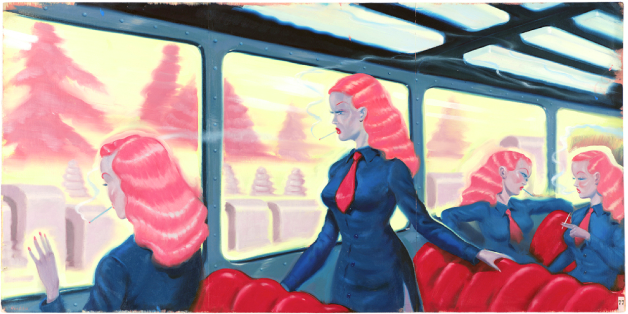
I ran across some work from Ryan Heshka and thought it was very
interesting the way he designed in the vintage look with the whole
sci-fi appeal of the future. I was drawn to his art because it feels so
similar yet so different, with it's old feeling. It almost makes me feel
like the images could have at one point been photographs, they almost
have an eerie feeling.

His images make me feel like I'm in a time warp, I really enjoy the playfulness they convey.

I found him in
juxtapoz magaine.


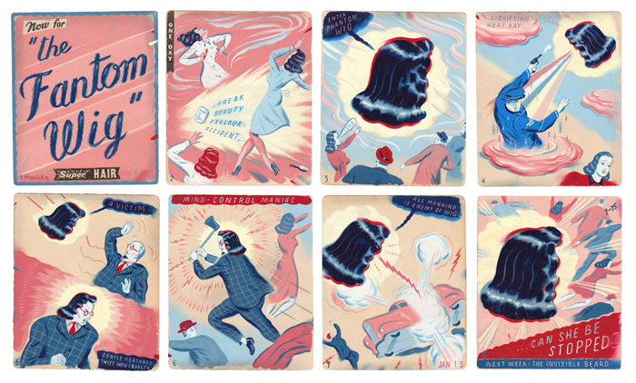
I admire that he only uses 3 colors throughout the whole story. I laughed when I see that the "Fantom Wig" terrorizing everything and everyone. I'm a sucker for vintage 1940-1950s pin up style women. I've never seen anyone combine all these elements together and the result is that it does indeed give off this strange setting and feeling.
ReplyDeleteI love this retro style, but it's so hard to replicate with vectors that I've barely even scratched the surface of attempting it! Just means that I can appreciate it all the more, though. Thanks for sharing!
ReplyDeleteWow I love that he has the same color scheme throughout the entire story. It makes me appreciate how art can be so eye-catching and simple at the same time. His technique really is amazing, anything similar to that would take me forever with Illustrator! I love that even though it has a vintage style, the subjects are futuristic. It's something that you wouldn't usually consider doing, but makes for a unique and impressionable piece of art.
ReplyDeleteI really like the intense use of line to create moment and emotion. Coupled with the colors I think this artist did a great job capturing this vintage sci-fi style.
ReplyDelete