
A really interesting site I found while looking around, is Alternative Movie Posters. It's collection of various remakes of classic movie posters, in some really different styles that are all created by just regular people. So some are a bit lacking in quality, but for the most part there are some very interesting takes on poster designs.
That aside, there are many other really interesting posters I've found on that site. Of those I've found, my favorites tend to be the very simplified sort of style.
I really like this. I am also a big fan of alternate movie posters. One of my favorite artists, Alex Pardee, does them for movies like Sucker Punch, Inglorious Bastards, and Watchmen. I love the opportunity to make them into a piece of art as well as a movie poster.
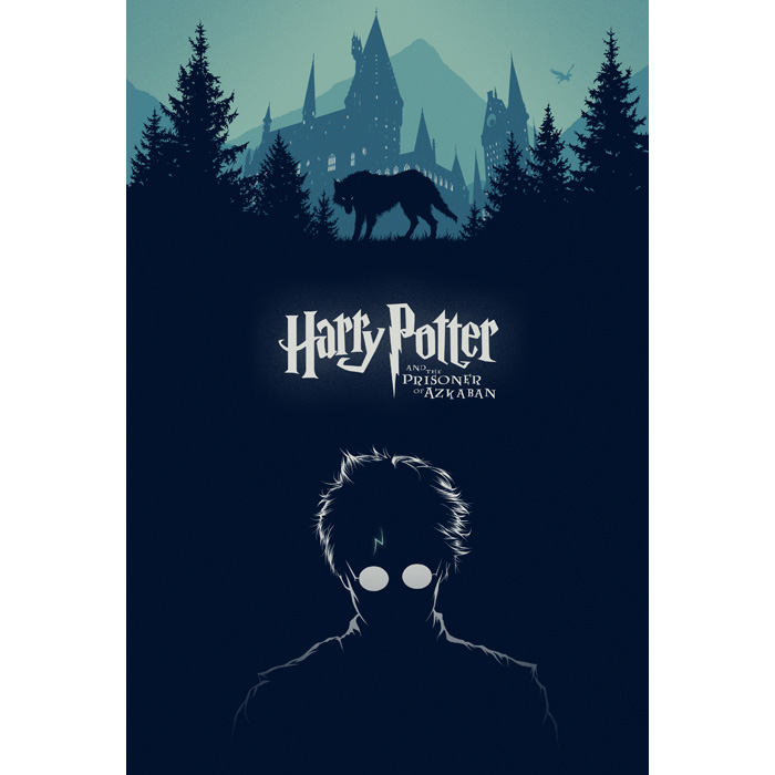
ReplyDeleteAgreed people who take movie posters and make them artsy and get creative with them usually come out really well and do a great job creating them. I like this one a lot because it just so happens to be that the Prisoner of Azkaban was my favorite Harry Potter book in the series and this would of been a really cool poster to look at when they were advertising the movie.
ReplyDeleteI've heard a lot of great things about that website. I think it is a really interesting idea and especially like this Harry Potter poster. Like you said, the contrast grabs your attention, especially Harry's glasses at the bottom. I enjoy the way the artist drew Hogwarts, it is simplified but still obvious what it is. I also really like the light in Harry's hair, it also shows contrast and creates interest using a few simple strokes.
ReplyDeleteThe style of this poster is very eye catching and reads "Harry Potter" in a different way than I am used to seeing. Most Harry Potter posters I have seen are real images being used, so this is a nice breathe of fresh air. I really admire their use of color. The way it seems to fade into the distance is interesting because it goes from dark to light instead of light to dark. Although this is not how you usually see distance depicted, I enjoy it almost better. Harry Potter's outline is also very neat because it's almost as though he is glowing out of the dark. All in all, great pick!
ReplyDeleteI've seen similar styles to the picture above on different alternative movie posters before and I am very attracted to that type of style. I love the use of tints and shades and the color choice used in this Harry Potter poster. Due to its simplicity, its a great fresh take on what we normally see. I could see this on my wall in my room or even the living room. Its settle but still very powerful to look at.
ReplyDeleteIt's always interesting to see other artists interpretation on movie posters. It's like removing the Hollywood from posters and letting them shine as art by themselves, very cool.
ReplyDelete