In my Typographics II class we're designing our own packaging concepts for ice cream. For this project my inspiration came from an unexpected place. Specifically Rogue Ales, a craft beer brand that I recently discovered. It's huge variety of unique flavors such as Voodoo Doughnut Pretzel, Raspberry & Chocolate Ale simultaneously appealed to my viscous sweet tooth and the dark beer snob in me. This aspect combined with the colorful packaging with creative illustrations sold me pretty quickly. Rogue Ales manages to have brilliantly designed unique package design for each one of their dozens of award winning beers (over 40), while retaining the brand identity. They use the same bold, slab serif logo and repetition of the star shape, with a personal touch of hand illustration and vintage stamped look. Rogue gets even more personal with their "Mom Hefeweizen," "Dad's Little Helper Black IPA," and "Beard Beer" (this one is brewed with yeast from a real beard). If bacon's your thing, they have a maple bacon ale. I think I'll stick with my chocolate donut beer, thanks. Anyway, I think Rogue has a really clear, successful and uniquely designed brand identity and makes a delicious cold brew.

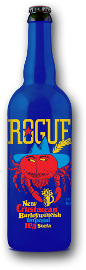


It's amazing how wildly different each of these designs are, and yet they wind up making a cohesive and recognizable label. Even though the graphics are different with a majority of these brews, the label remains consistently legible and clear. It's always at the top, always in the same typeface and always easily distinguished from the remainder of the design.
ReplyDeleteThe designs are really something. For one, I'm a sucker for dynamic shading in these images so that definitely appeals to me. The other thing I like about this design is the unique but harmonized styles to make sure buyers can still recognize the same product with image alone.
ReplyDeleteI'm a huge fan of the bacon ale, its not as bad as some might think! Rogue has always stood out when compared to other brews on the shelf, the simplicity in design, vintage imagery and very recognizable large bold logo catches the eye. In my opinion they really know how to brand themselves and appeal to a targeted audience.
ReplyDelete