
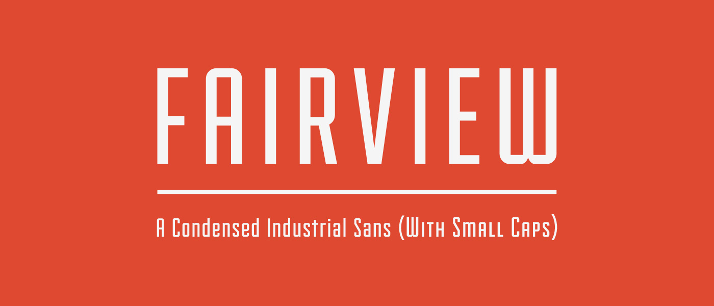
 this is Fairview. I used it for my Siberian Husky inforgraphic project because it reminded me of Communist Russian propaganda font styles. It's a bummer that no lower case exists, but the small caps gives it a little more versatility.
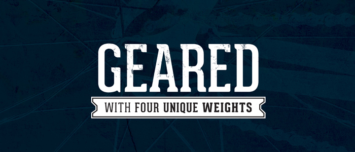
Geared is a condensed slab serif that I has been used in the past as the font of the NAU quidditch team. As a slab serif it is similar to classic athletic fonts, but its curved serrifs bring an element of playfulness as well. It is also super versatile because it comes in 4 weights, upper, lower, symbols, and numbers.
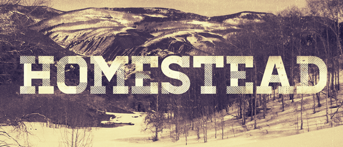
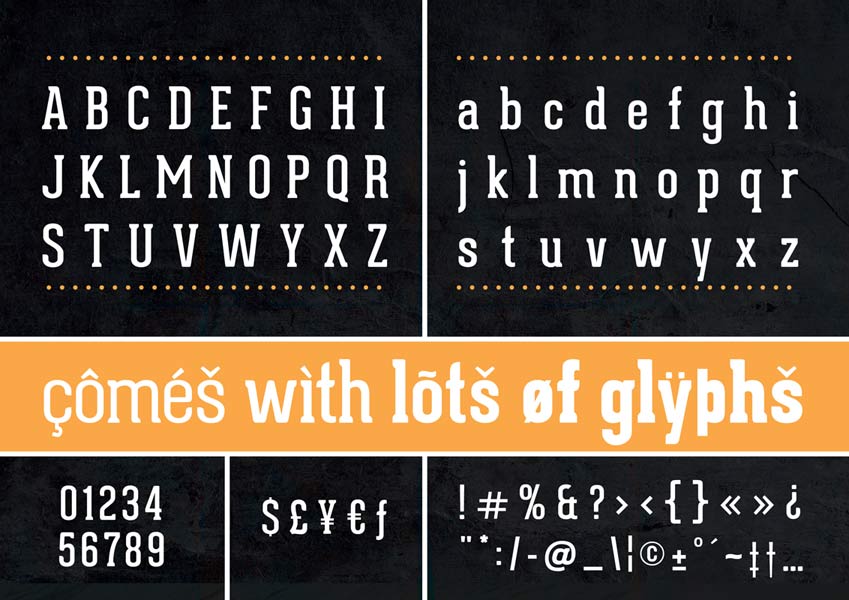
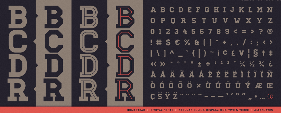 Like Geared, homestead is a bold slab great for headers. It is incredibly varied because of the different styles such as rounded, inline, and my favorite the plaid one seen up top. It works awesome for Flagstaff/ lumberjack theme designs.
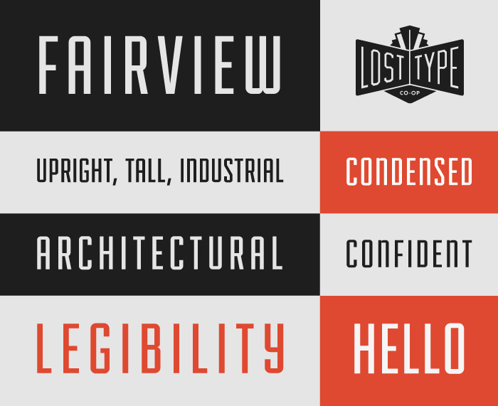
In addition to the great fonts, Lost Type also has a blog (http://losttype.com/blog/) where they post a lot of great stuff from their designers as well as real life examples of type that have inspired them.
I like their website, the colors work well together and they make me think of a circus. I know it is probably bad but I really like that they give you the option to not pay for the font. But I agree if I were to ever do a design in an professional capacity I would absolutely pay for the font because the designers work very hard to design them.
ReplyDelete