
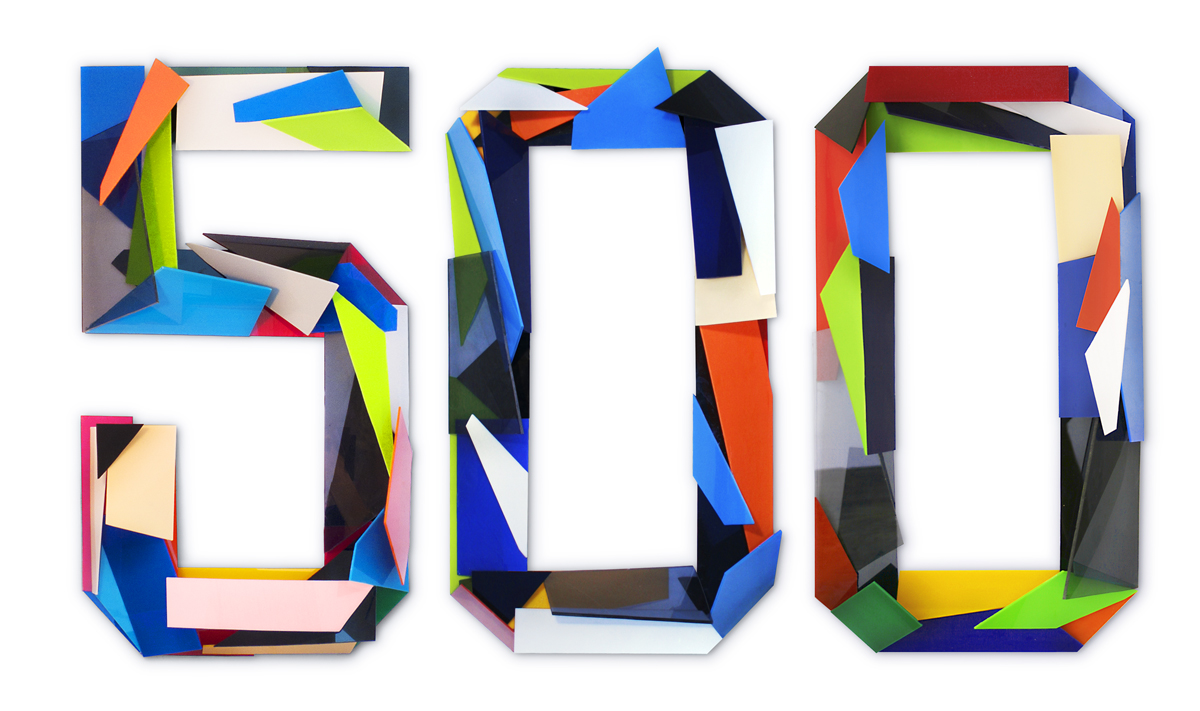
 I was searching for inspiration for designing website a with a more interesting layout. I stumbled upon this portfolio website and found myself spending some time reorganizing the icons into various layouts.
The site also seems relevant to the idea of "branding" that we talked about in class. The haphazard approach he takes to organizing the images is consistant and highly representative of the style that he demonstrates in his other work like this. I was also really impressed with everything he had in his portfolio, very creative approaches.

You're right, that website is addicting! I've been looking at it for what seems like ages to try and figure out what all he did to create such a great portfolio website! It's over-the-top interactive, but that doesn't take away from the display of his work. Overall I was extremely impressed with his work, it's simple and sleek despite his sometimes-hypnotic take on colors/geometric shapes.
ReplyDeleteI also like the haphazardness of these layouts. Even without knowing what the product or company is, it makes you want to stay on their site. After taking Ben's class, my appreciation for web design has sky rocketed.
ReplyDeleteI like this idea on paper, but in practice it just annoyed the hell out of me. Reading the post I was super excited to get into the portfolio and play around, but I just found my self bothered by continuously moving things around to find other things and then having elements lay on top of each other.
ReplyDeleteNow if this was more of an art based project I think it would be brilliant and definitely work. I can see having an interactive art piece with this being incredible. I don't know if your portfolio itself should be an art piece.
As a portfolio, I don't know. I guess it works for some people, but for me when I look at someones portfolio I just want to see the work in a nice clean layout. There's nice work in the website, but I just want to see it there, I don't want to work to see it.
I really like the way these look. It is a totally different concept and it really is cool. The website is so interactive, I couldn't help but mess with it for a while. I think that says a lot about it work and how he is trying to come across as a designer.
ReplyDelete